Interactive Example
Astro offers several variations of the Slider component to accommodate multiple use case scenarios.
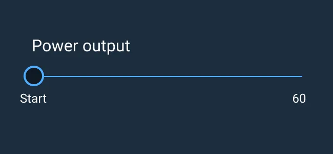
- Continuous Slider: A Continuous Slider is used to select any value along a range, such as 0 to 10.
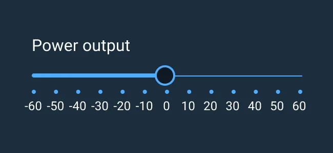
- Discreet Slider: A Discrete Slider is used to select from a set of pre-defined, specific values along the range, such as 0, 2, 4, 6, 8, 10.
- Dual Range Slider: A Slider with two thumbs, allowing a selection to be made as a range between the two points. A Dual Range Slider can present with or without the discreet markers below it.
Rules of Thumb
- It is not recommended to use a Slider when a very large value range exists. A range of 1,000, or fractional increments such as 4.35, may be too specific to use a Slider. Consider using a numeric Input Field instead.
- It is not recommended to use a Dual Range Slider when selecting only a single value.
- Sliders are typically used along a horizontal axis but may be used along a vertical axis when appropriate. For example, zooming in or out along a map or to mimic a vertical gauge on a physical dashboard.
- Display of the selected value is recommended. Consider a numeric Input Field or, at minimum, a Tooltip to indicate the selected value.
- Display of start and endpoints, as well as intermediate points (particularly for discrete sliders), is recommended.
Use a slider:
- When users need to set defined, contiguous values (like volume or brightness), or a range of discrete values (like screen resolution).
- Use a Dual Range Slider when an exact number isn’t needed, only a general span.
- To display abstracted values like “Low,” “Medium,” or “High.”
- To reflect discrete numeric values by adding labels.
- To give users immediate feedback on selection such as screen contrast.
Sliders may be used in conjunction with an Input Field or Select Menu allowing the user to set a Slider value via keyboard entry.
Appearance and Behavior
To achieve the split color element in the slider, a small amount of JavaScript is needed. Refer to Slider documentation in the Git repository for more information.
A Slider is comprised of a track aligned along a vertical or horizontal axis, a visual indicator of where on the axis the current selection exists, and value labels. The visual indicator of the selection value comprises of a selection fill and a thumb indicator. The user slides the thumb along the track until it reaches their desired value. The Slider’s label generally appears above the Slider and aligned to the left side of the track. In certain situations, the label may appear to the left of the Slider and vertically center-aligned to the track.
Variations on the Slider may include vertical implementations, using tick marks to indicate specific values, visual indicators of scale, and alternative ways to display the selected value in addition to position of the Slider’s “thumb” indicator (such as a numeric Input Field or Tooltip).
A Dual Range Slider is an input for setting a pair of values that represent a range. It features a horizontal track, spanning minimum and maximum allowable values (represented by the left and right bounds respectively), and uses two thumbs for the user to select the minimum and maximum values within that range. The left thumb represents the smallest value and the right thumb represents the largest value. One or both thumbs can be dragged to create a selection between the two points.
To learn more about adding Help Text to Sliders, see the Forms and Validation guidance.
Examples


Asset Status
| Asset | Version | Status |
|---|---|---|
| Documentation | N/A | Available |
| UI Kit - Dark | v7 | Available |
| UI Kit - Light | v7 | Available |
| UI Kit - Wireframe | v7 | Available |
| Web Component | v7 | Available |
| Component Tokens | v1 | Available |