Interactive Example
A card is a container for a few short, related pieces of information. It roughly resembles a playing card in size and shape, and is intended as a linked, short representation of a conceptual unit.
Rules of Thumb
- Limit actions on a card. Actions should be simple, direct, and predictable. Actions should clearly indicate what will happen when selected.
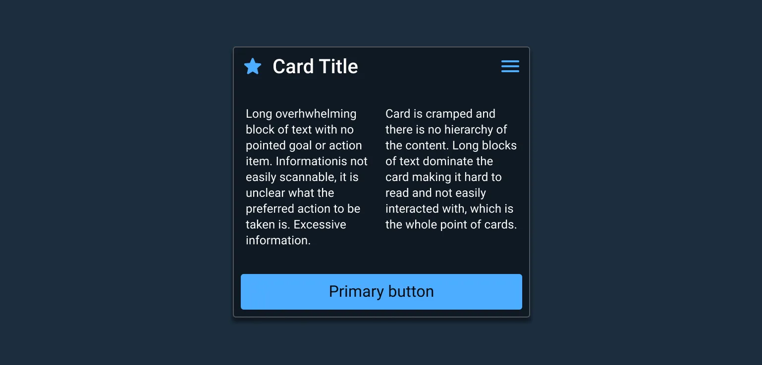
- Display content with a logical hierarchy, setting clear prioritization of content.
- Cards should be self-contained, without relying on surrounding elements for context. It cannot be merged, divided, or split.
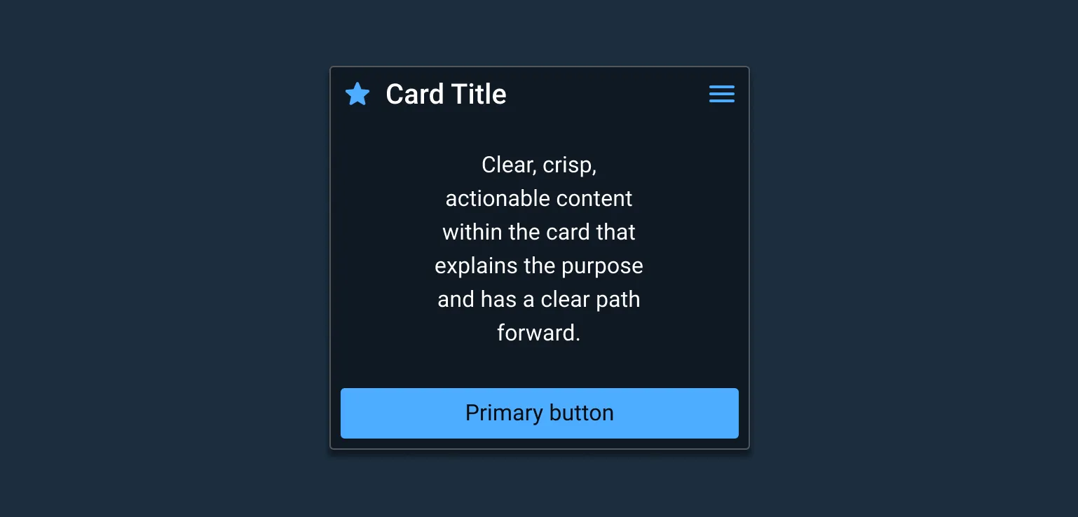
- Copy should be scannable; content is crisp, brief, and focused. Actionable language is preferred. Passive voice should be avoided.
- Identify “Hero content”, but limit them to 1-2 elements. These draw attention.
- Content should be actionable. Structured with visual hierarchy to bring prominence to important content. Be clear about content that requires user action.
Appearance and Behavior
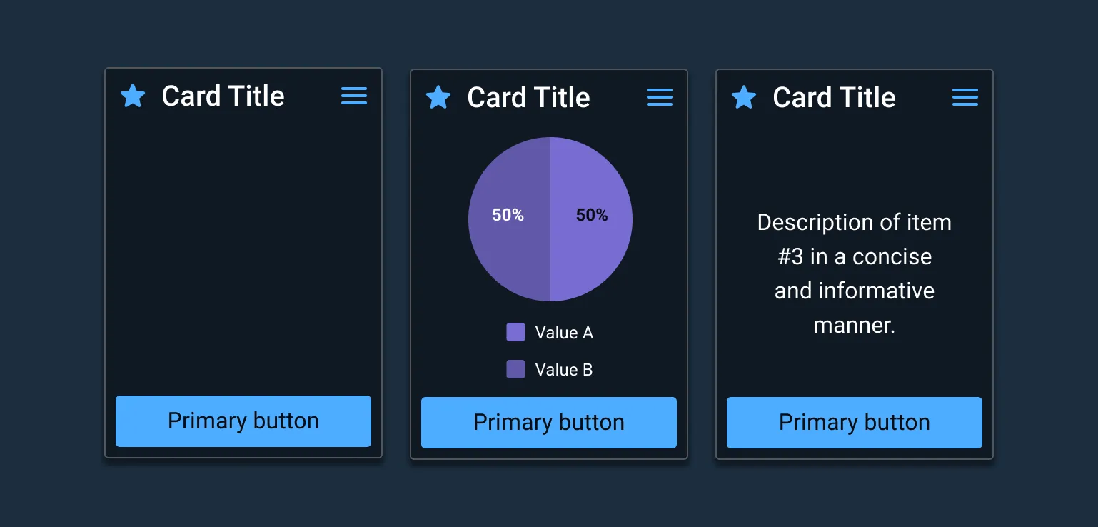
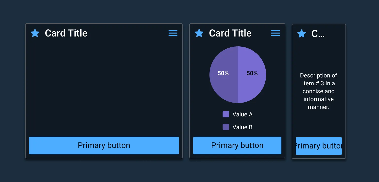
Cards contain content and actions about a single subject.
Cards have a header with left and right slots, footer, and body slot where custom content can be inserted. A slot is an invisible space holder in the foundation of the design that allows outside content to be inserted into the component in the place of it, while maintaining the component’s structure and behavior while integrating the new element. Card can have any, all or none of its elements visible. The body slot can accept any kind of content, from images to text, as long as it fits within the slot.
Cards have 4 key properties:
- Grouping information
- Presenting summary content & a link to additional details
- Resemble playing cards
- Allow for flexible layouts
Compliance rules
Use sentence case unless an extenuating circumstance arises.
Examples
Asset Status
| Asset | Version | Status |
|---|---|---|
| Documentation | N/A | Available |
| UI Kit - Dark | v7 | Available |
| UI Kit - Light | v7 | Available |
| UI Kit - Wireframe | v7 | Available |
| Web Component | v7 | Available |
| Component Tokens | N/A | Planned |