Interactive Example
Rules of Thumb
- Important information should always be visible on the page.
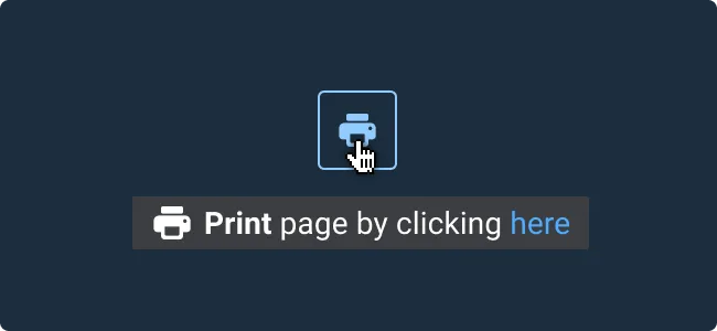
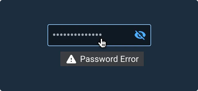
- Don’t use to mirror visible content, communicate errors, or display interactive links or menus.
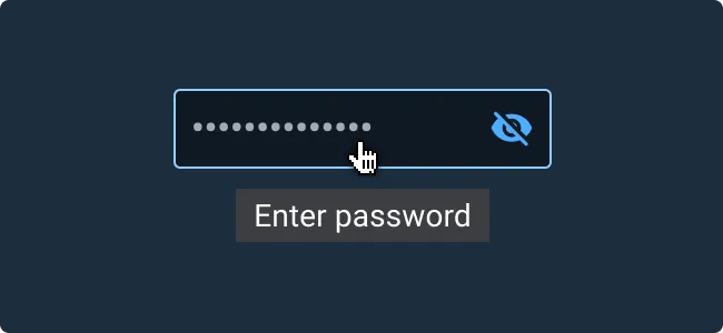
- Use for small amounts of contextual information.
- Avoid tooltips in areas with dense information, as the screen may become crowded as the user moves throughout the application, blocking other visual information. Instead, use a Pop Up to have information appear on click rather than hover.
Appearance and Behavior
Appearance
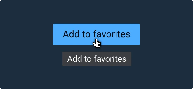
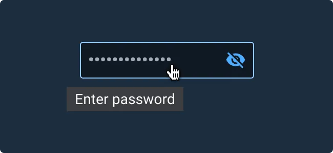
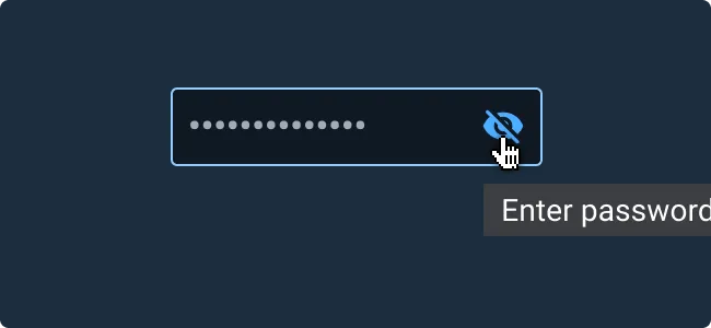
Tooltips have consistent text styling and do not include icons, rich text, images, links, or actions. If those options are desired, consider using the Pop Up component.
Behavior
Tooltips display informative text in a message box when the user has hovered or paused their mouse over an associated UI element for a brief length of time (800 ms by default). They can also be activated by focusing an element using the keyboard or voice activation. They should remain visible if the user briefly moves the mouse off and back on to the target. When the user exits the element area, moves the cursor off the element by scrolling, or clicks on another UI element, the Tooltip is hidden.
Examples


Asset Status
| Asset | Version | Status |
|---|---|---|
| Documentation | N/A | Available |
| UI Kit - Dark | v7 | Available |
| UI Kit - Light | v7 | Available |
| UI Kit - Wireframe | v7 | Available |
| Web Component | v7 | Available |
| Component Tokens | N/A | Planned |
Status Key
AvailableIn ProgressPlannedNot AvailableDeprecated