Focus States enable a better experience for users with visual or motor impairments and those who prefer keyboard and voice control to navigate through an application.
Appearance and Behavior
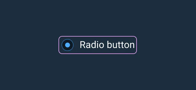
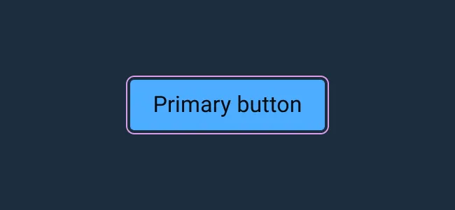
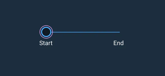
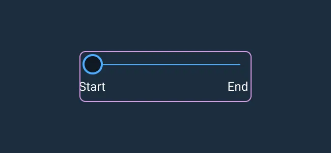
The Focus State consists of a 1 pixel outline which sits 2 pixels away from the focused element. The Focus State uses a bright pink color style, as it stands out from the rest of the Astro color palette sufficiently to attract a user’s attention.
Generally, the Focus State encompasses the part of the element that is interactive. In certain cases, such as the slider component, the thumb is interactive. With simpler elements that have labels (like radio and checkboxes), giving focus to the whole component makes the intention of the form item more clear (for example, this radio is connected to this text label).
Focus should only appear when using the keyboard or voice control. Use the css pseudo-element :focus-visible rather than :focus to achieve this.
Here is an example of focus CSS using Astro design tokens.
&:focus-visible {
    outline: var(--border-width-focus-default) solid var(--color-border-focus-default);
    outline-offset: var(--spacing-focus-default);
    border-radius: var(--radius-base) //optional
}
Rules of Thumb
- Only one Focus State can exist on the screen at any time.
- Utilize established reading patterns to create the order of elements that will receive focus on a page.
Examples

Asset Status
| Asset | Version | Status |
|---|---|---|
| Documentation | N/A | Available |
| UI Kit - Dark | v7 | Available |
| UI Kit - Light | v7 | Available |
| UI Kit - Wireframe | v7 | Available |
| Web Component | v7 | Available |
| Component Tokens | N/A | Planned |