Interactive Example
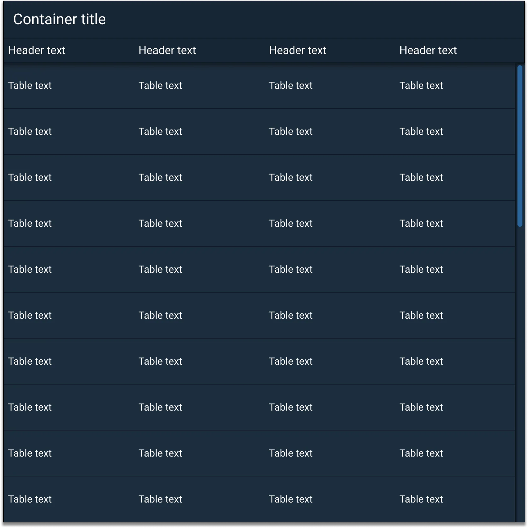
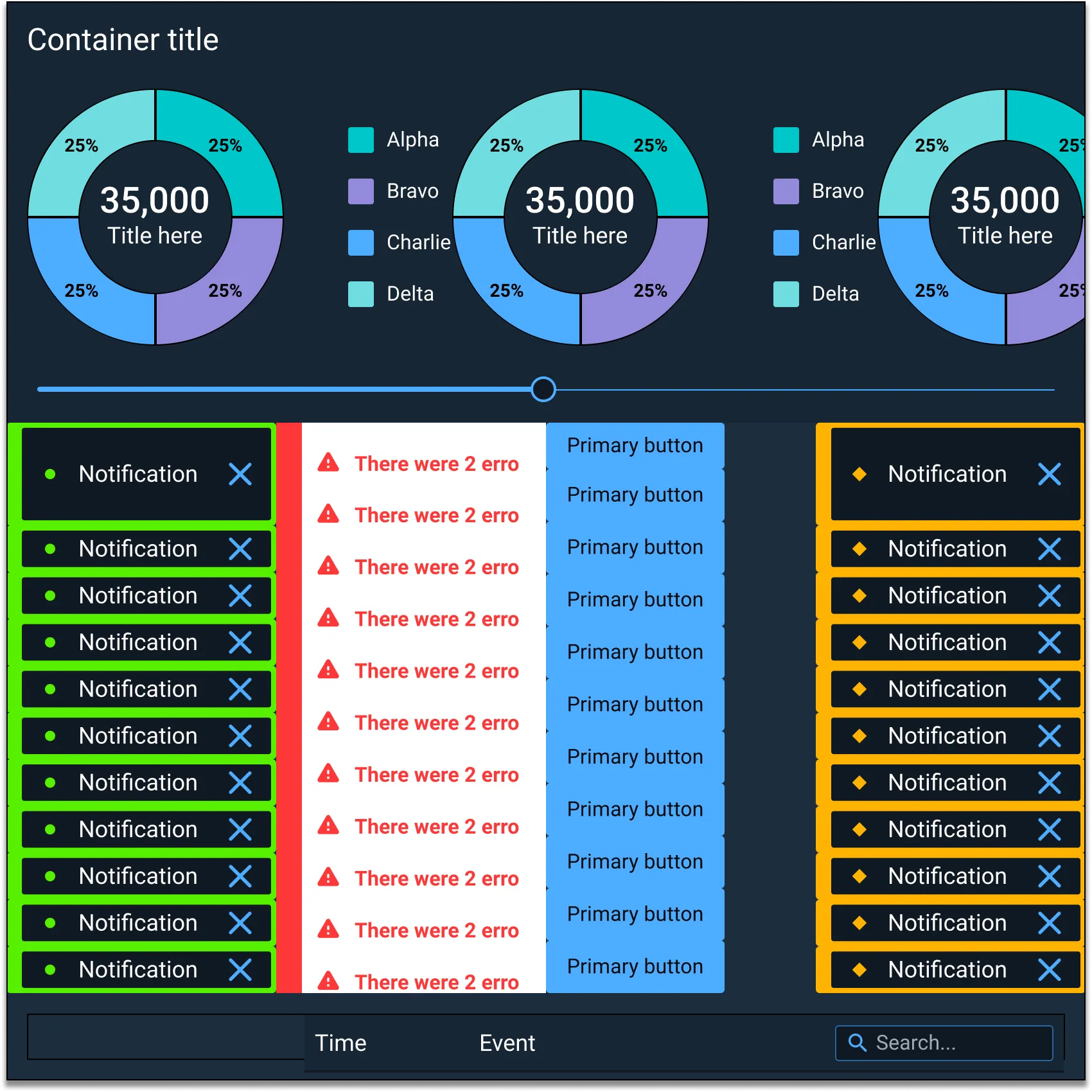
Containers can be used to help effectively manage lists, tables, dialogs, modals, slide out panels, content containers (top and bottom), and other components.
Appearance and Behavior
Containers have sections for a header, a tab bar, a toolbar, body content, and a footer.
The Container component uses an optional drop shadow that can help distinguish it from other UI elements (e.g. applied in “overlay” situations, such as dialogs and slide-in panels).
Child containers (smaller Containers meant to reside inside of a larger Container) consist of a header, room for custom content on the left and right of the header text, and body sections. The body section can be used as a canvas to freely overlay multiple components.
Examples
Asset Status
| Asset | Version | Status |
|---|---|---|
| Documentation | N/A | Available |
| UI Kit - Dark | v7 | Available |
| UI Kit - Light | v7 | Available |
| UI Kit - Wireframe | v7 | Available |
| Web Component | v7 | Available |
| Component Tokens | N/A | Planned |
Status Key
AvailableIn ProgressPlannedNot AvailableDeprecated