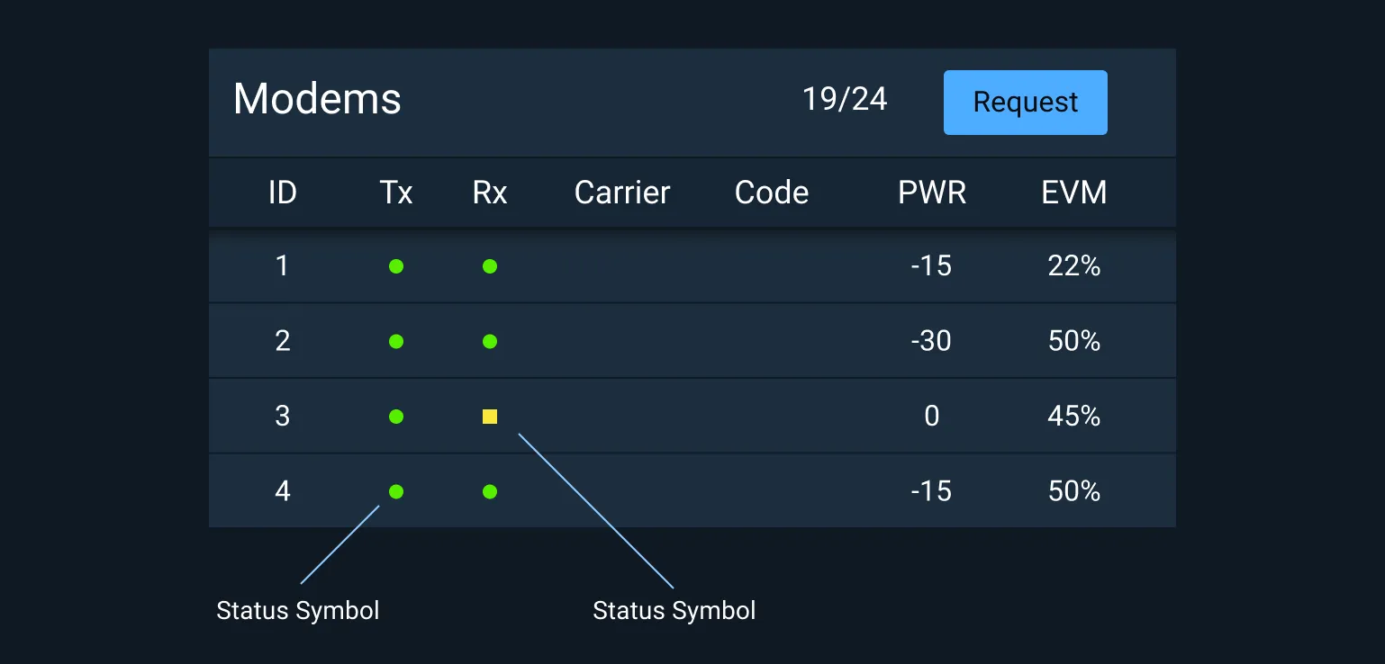
Interactive Examples Astro Status Symbols in context of a modem list layout. Rules of Thumb
Use the standard set of Status Symbols provided.
Only use the provided colors for status.
Use the highest color possible if multiple statuses are consolidated. For example, if the statuses of underlying components are green, yellow, and red, the consolidated indicator is red.
Related Pages
For a detailed description of how Status Symbols are used within Monitoring Icons, see
Icons and Symbols
.
To learn more about the usage of status colors, see
Status System
.
Status Colors Status colors are provided for both light and dark theme versions of Astro in Hex, RGB, and CSS Custom Property values.
Dark Theme Status Colors
Hex RGB CSS Synonyms #ff3838 255,56,56 --status-symbol-color-fill-critical-on-darkCritical, alert, form error, emergency, urgent #ffb302 255,179,2 --status-symbol-color-fill-serious-on-darkSerious, error, distress, needs attention #fce83a 252,232,58 --status-symbol-color-fill-caution-on-darkCaution, warning, unstable, unsatisfactory #56f000 86,240,0 --status-symbol-color-fill-normal-on-darkNormal, on, ok, fine, go, satisfactory #2dccff 45,204,255 --status-symbol-color-fill-standby-on-darkStandby, available, enabled #a4abb6 158,167,173 --status-symbol-color-fill-off-on-darkOff, unavailable, disabled
Light Theme Status Colors
Hex RGB CSS Synonyms #ff2a04 255,42,4 --status-symbol-color-fill-critical-on-lightCritical, alert, form error, emergency, urgent #ffaf3d 255,175,61 --status-symbol-color-fill-serious-on-lightSerious, error, distress, needs attention #fad800 250,216,0 --status-symbol-color-fill-caution-on-lightCaution, warning, unstable, unsatisfactory #00e200 0,226,0 --status-symbol-color-fill-normal-on-lightNormal, on, ok, fine, go, satisfactory #2dccff 45,204,255 --status-symbol-color-fill-standby-on-lightStandby, available, enabled #7b8089 123,128,137 --status-symbol-color-fill-off-on-lightOff, unavailable, disabled
Light Theme Status Symbol Borders
In light theme Status Symbols should have a 1px border set to the inside of the symbol.
Hex RGB CSS Synonyms #661102 102,17,2 --status-symbol-color-border-criticalCritical, alert, form error, emergency, urgent #664618 102,70,24 --status-symbol-color-border-seriousSerious, error, distress, needs attention #645600 100,86,0 --status-symbol-color-border-cautionCaution, warning, unstable, unsatisfactory #005a00 0,90,0 --status-symbol-color-border-normalNormal, on, ok, fine, go, satisfactory #285766 40,87,102 --status-symbol-color-border-standbyStandby, available, enabled #3c3e42 60,62,66 --status-symbol-color-border-offOff, unavailable, disabled
Asset Status
Asset
Version
Status
DocumentationN/A Available
UI Kit - Darkv7 Available
UI Kit - Lightv7 Available
UI Kit - Wireframev7 Available
Web Componentv7 Available
Component Tokensv1
In Progress
Available
In Progress
Planned
Not Available
Deprecated


