The Data Visualization section covers best practices, principles, and references tailored to Astro. A core objective of a Data Visualization is to make complex information accessible and easy to digest. Therefore, the interface presenting the data should be clean and straightforward in order to minimize users’ cognitive load and time spent searching.
Visualizing data taps into pattern recognition ability and significantly accelerates the understanding of the data. You can look at a chart of data presented and understand it quickly by seeing the patterns and trends. This is a significantly faster way to comprehend information compared to reading numbers, comprehending the math, and then imagining in your mind how the numbers relate to each other.
Common Chart Types for Data Visualization
There are a significant number of chart types to cover many different ways of presenting data to users. The following subset of categories and examples were found to be complimentary to use cases within the Space domain. Astro will continue to expand upon this library as additional requirements are defined.
Astro Chart Categories
The following categories are used within Astro:
Part-to-whole: Show how a single entity can be broken down into its component elements. If the reader’s interest is solely in the size of the components, consider a magnitude-type chart instead.
Change Over Time: Give emphasis to changing trends. These can be short (intra-day) movements or extended series traversing years. Choosing the correct time period is important to provide suitable context for the user.
Correlation: Show the relationship between two or more variables.
Astro Chart Types
There are a large number of charting visualizations. The following subset is relevant to the Astro domain:
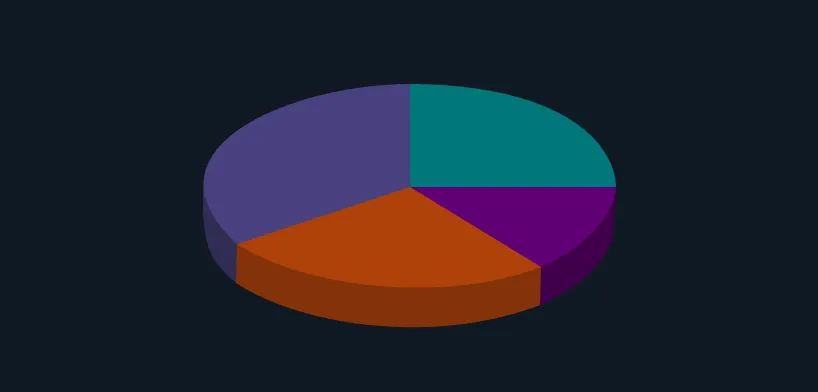
Pie Chart
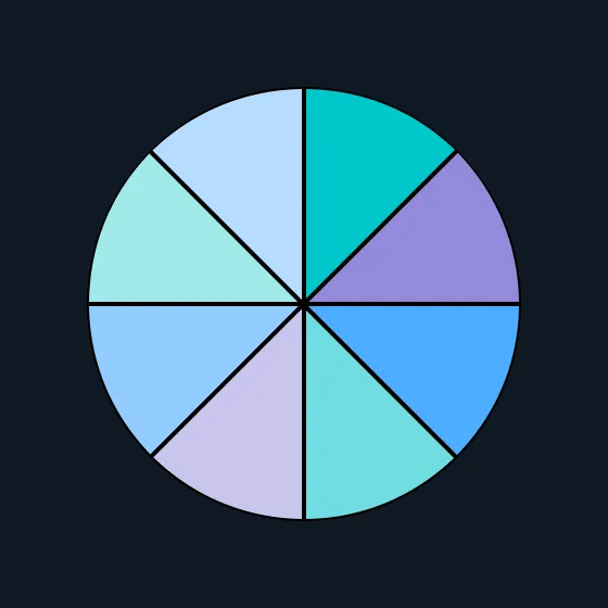
Conveys part-to-whole data. Pie charts are very common, but research has shown that it may be difficult to accurately compare the size of the segments without supporting data points.
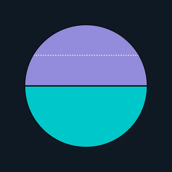
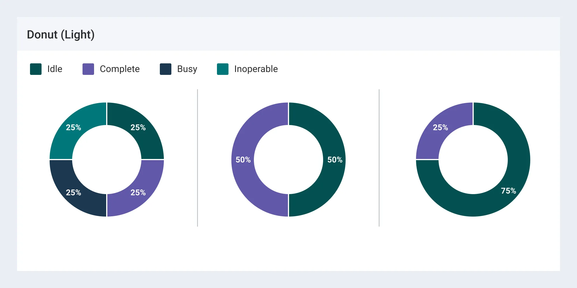
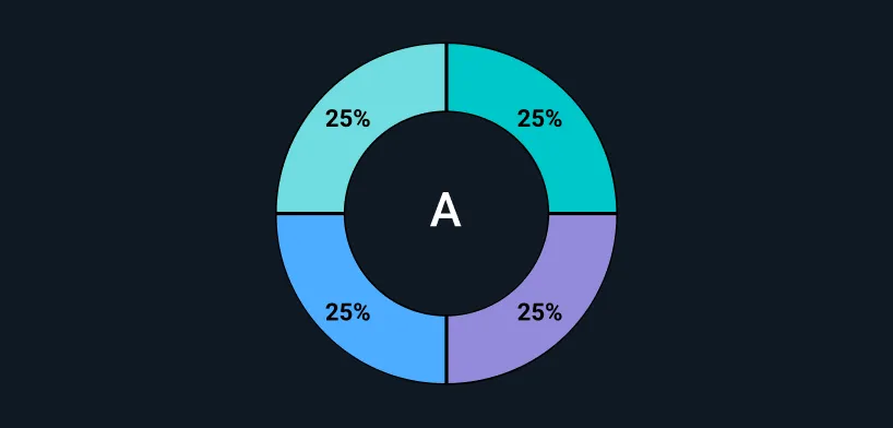
Donut Chart
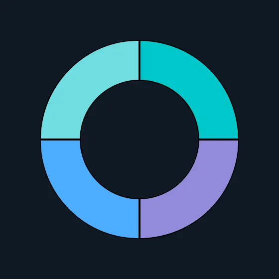
Similar to a pie chart – but the center can be useful for additional information about the data (e.g. total). Example: GRM Sample app - Equipment tab

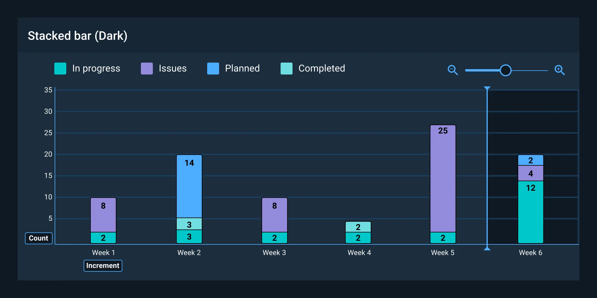
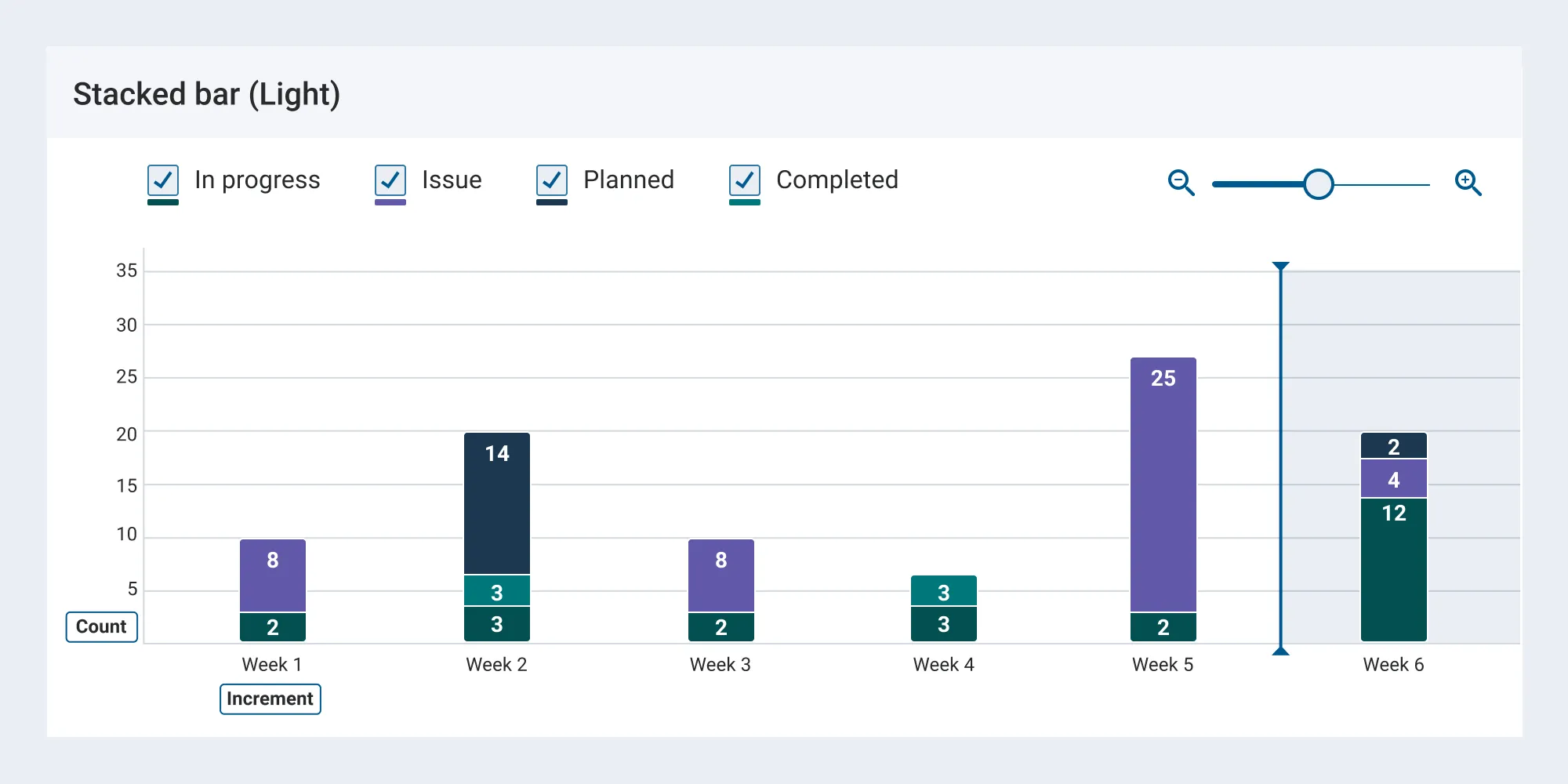
Stack Bar Chart
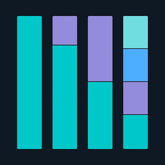
The standard way to show a statistical distribution - keep the gaps between columns small to highlight the ‘shape’ of the data. Example: GRM Sample app - Contacts tab
Heat Map
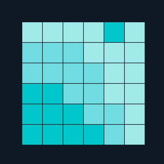
Heat maps enable you to do exploratory data analysis with two dimensions on the axes and the third dimension shown by intensity of color.
Learn more…
Area Chart
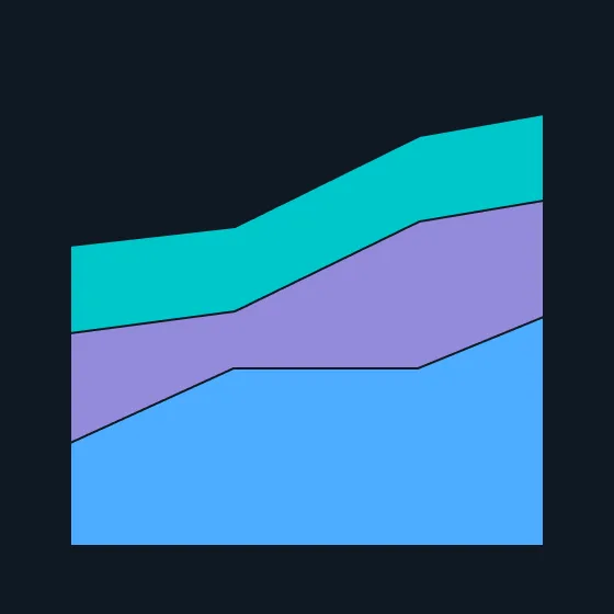
This chart type excels at showing changes to total, but seeing change in components can be difficult.
Fill Gauge
A circular shape that represents a percentage value of a whole. May also be depicted as a dial.
Bubble Chart

Bubble charts are used to visualize a data set with two to four dimensions. The first two dimensions are visualized as coordinates, the third as color, and the fourth as size.
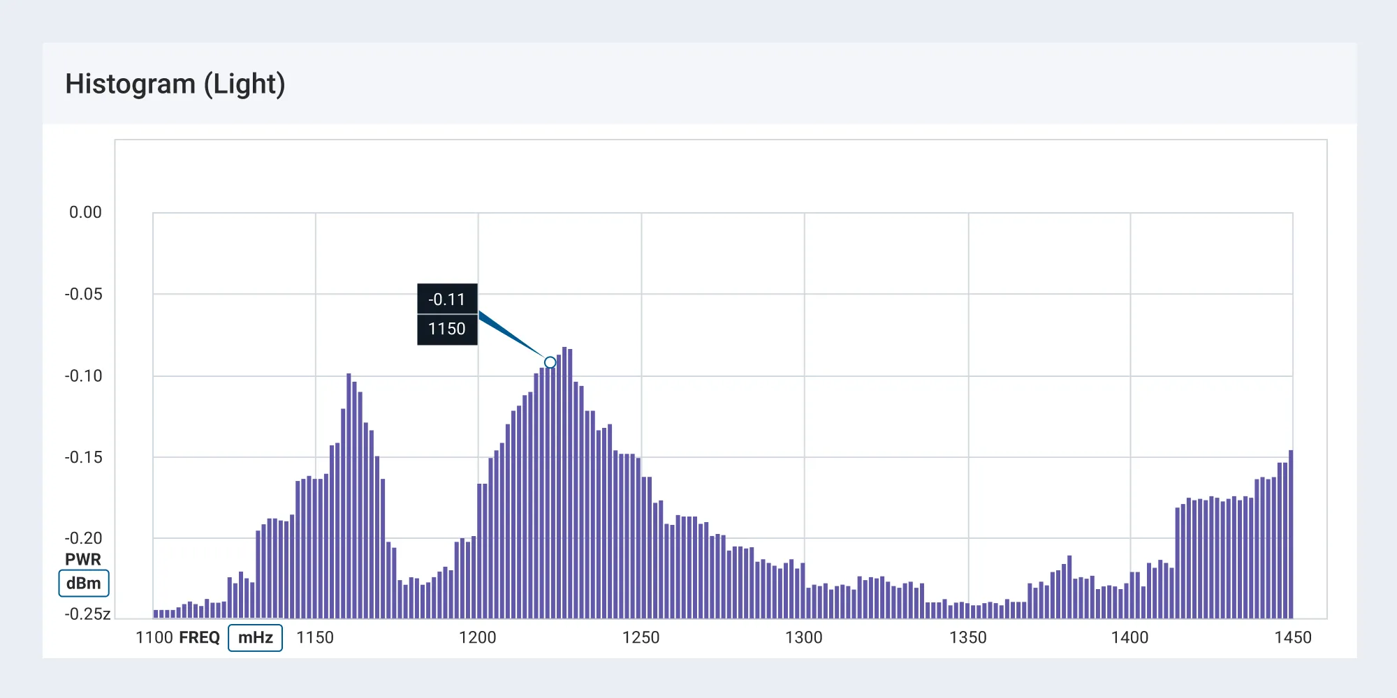
Histogram
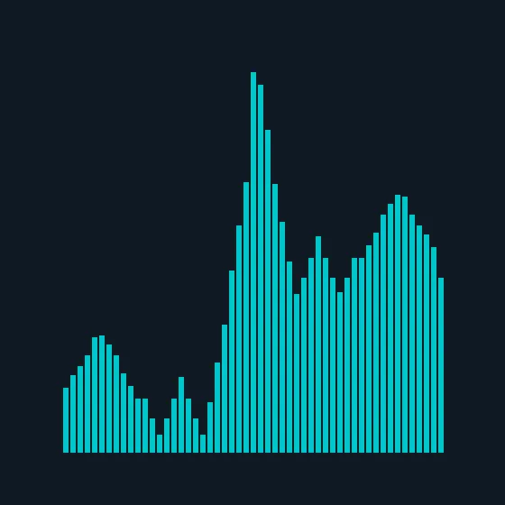
Conveys an accurate representation of the distribution of numerical data. It is an estimate of the probability distribution of a continuous variable.
Gantt Chart
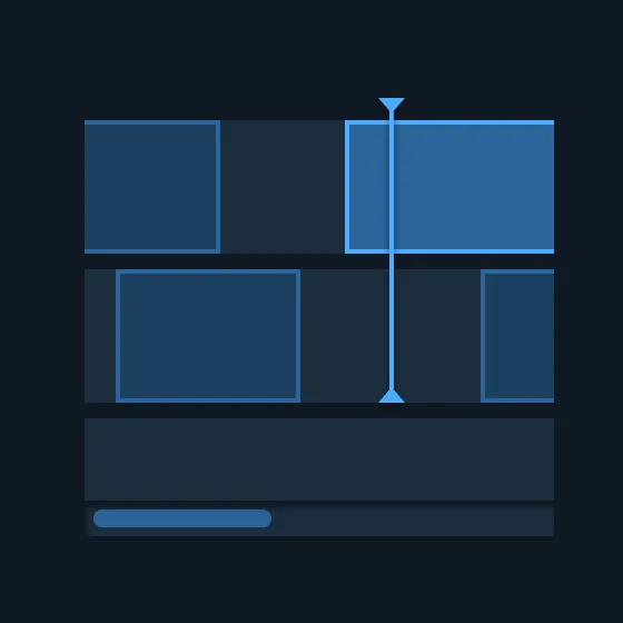
A chart that depicts how a set of resources are used over time. Gantt charts illustrate the start, end, and duration of tasks (e.g. timeline or schedule). Example: TT&C Sample app - Timeline view
Scatter Chart
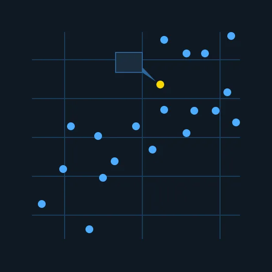
Scatter charts plot points on a graph. When the user hovers over the points, tooltips are displayed with more information.
Visualization Anatomy
The following images reference the general components and features for designing a visualization. Astro provides a variety of front-end components to support your design in the UI Components section.
Filter Select
Filters are used to narrow what is displayed in the table. They may be presented in the header as Select menus, as a Segmented Button (e.g. View Select), or as an Input Field.
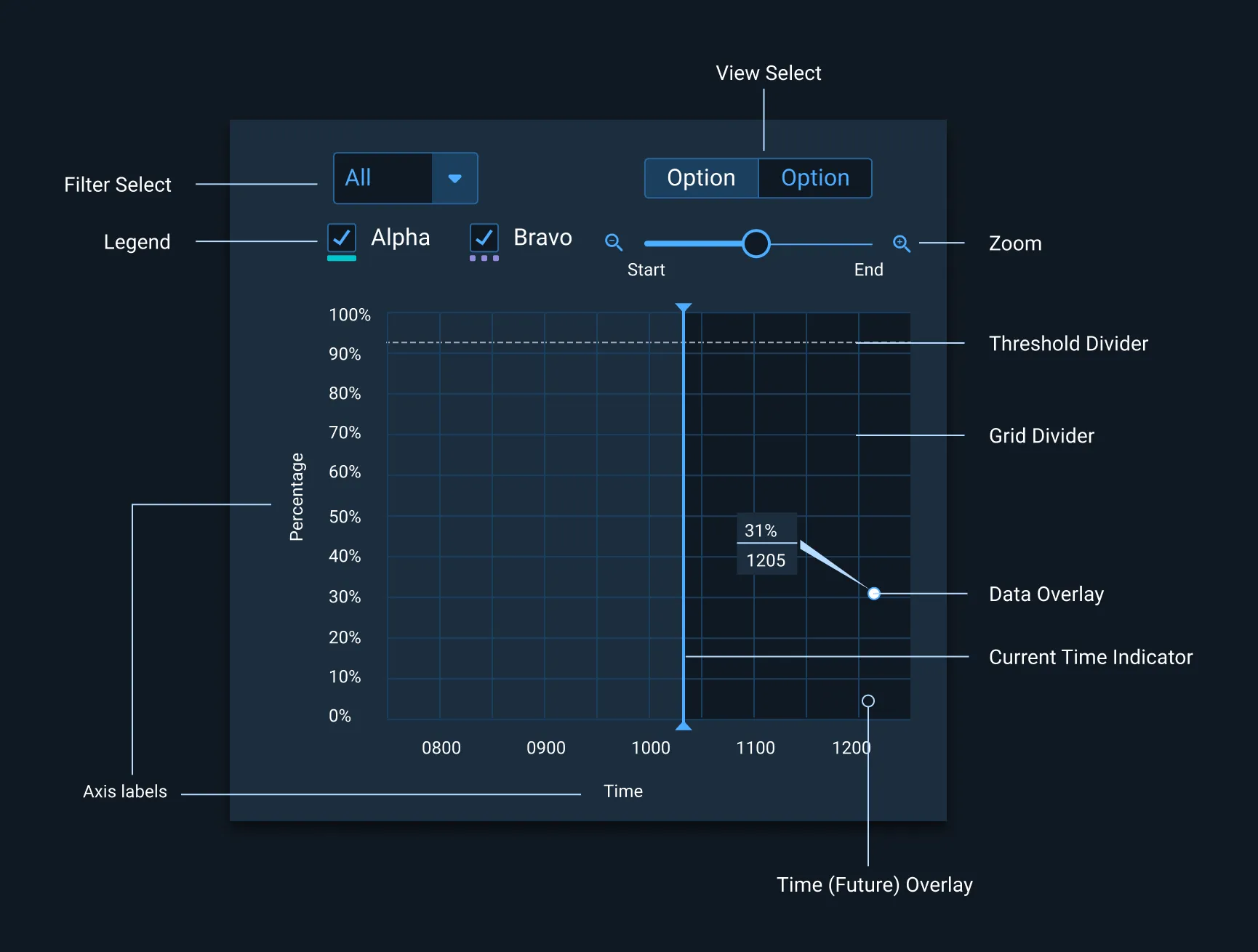
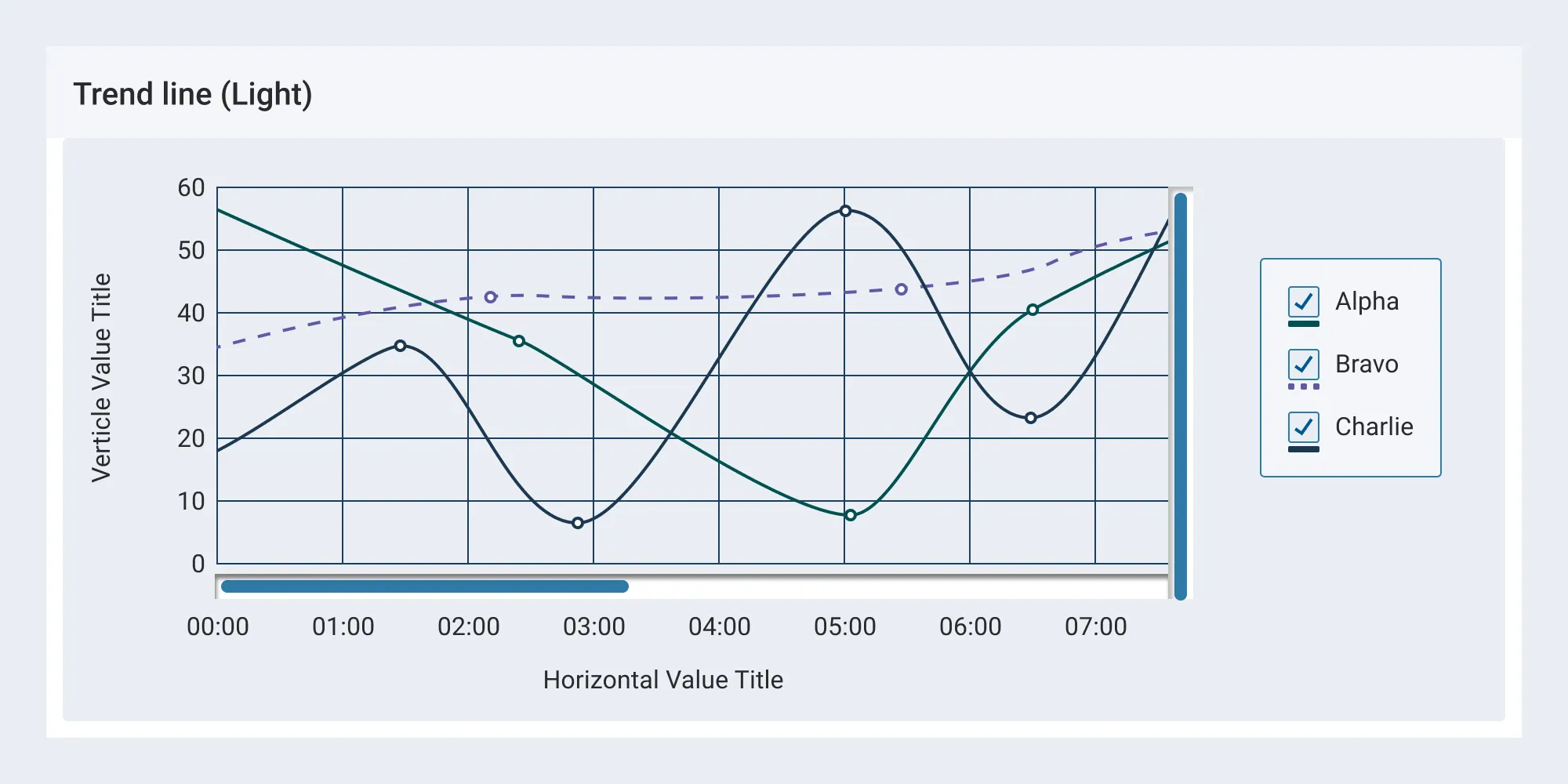
Legend
When the data appearing in a chart contains multiple data series, it becomes more readable if they are shown in a legend. This helps in identifying each data series/data point in the chart.

Legends should be arranged as per the order of appearance of the data plot (e.g.: if ‘Usage’ data is plotted first, the corresponding legend comes first).
Accessibility
Type: Astro guidelines dictate a minimum type size of 14pt for axes and data points to maximize legibility. Roboto or Roboto Mono, sans-serif typefaces, are required for optimum legibility. See Typography for additional information.
Color and Contrast: Use colors that have sufficient contrast for the appropriate theme. If necessary, complement the use of color with a pattern or texture to convey different types of information. The non-status palettes provided in the Color guidelines are applicable to both themes and are contrast compliant.
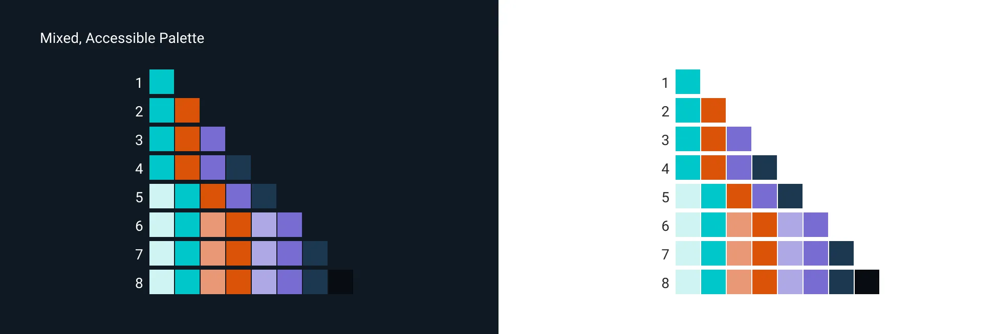
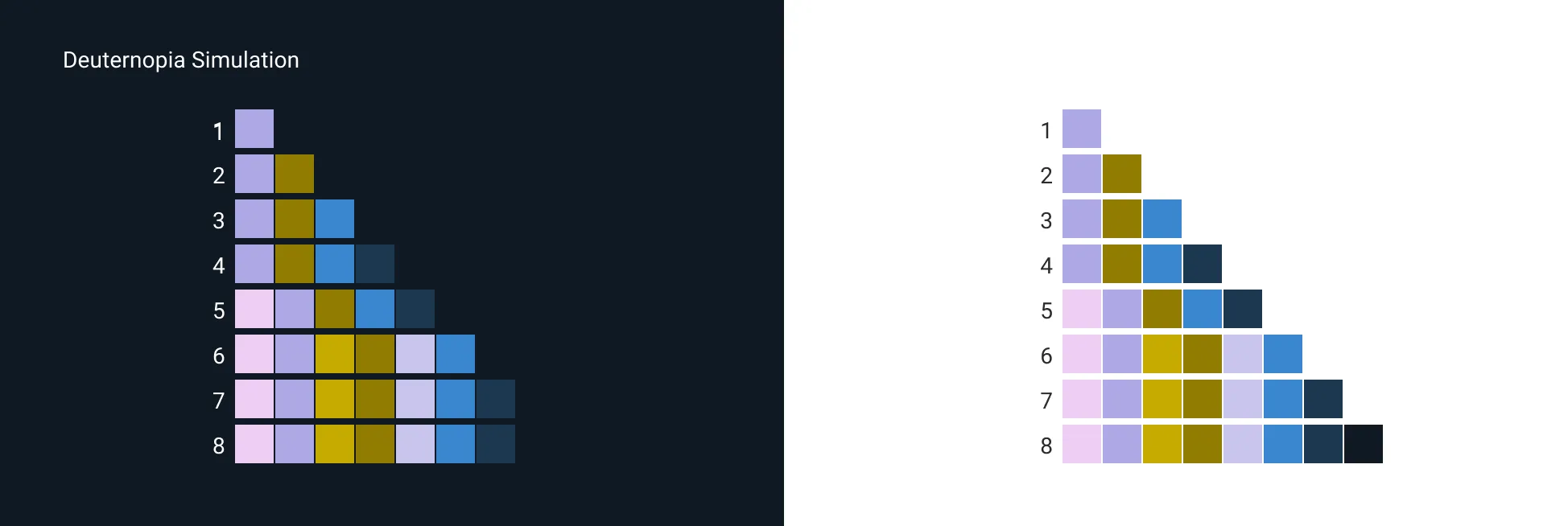
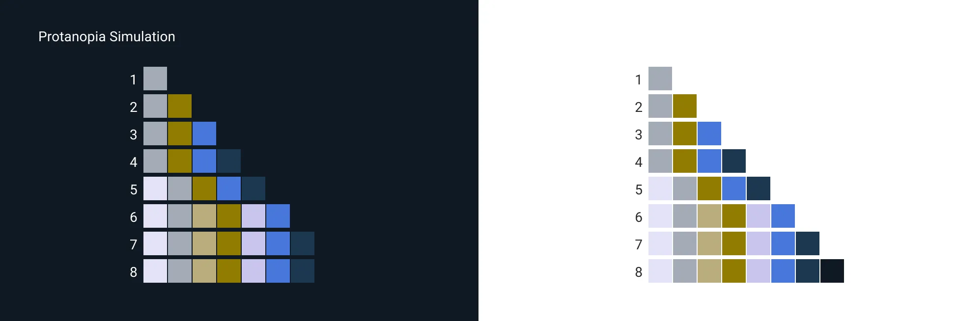
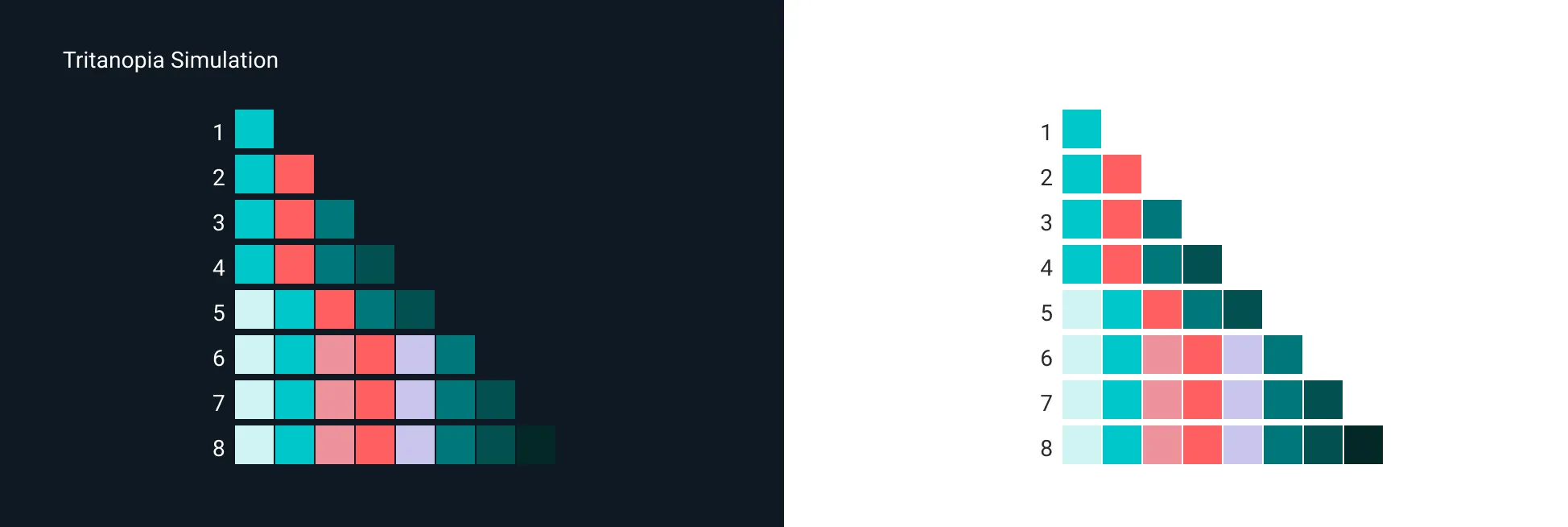
Mixed Accessible Visualization Palette
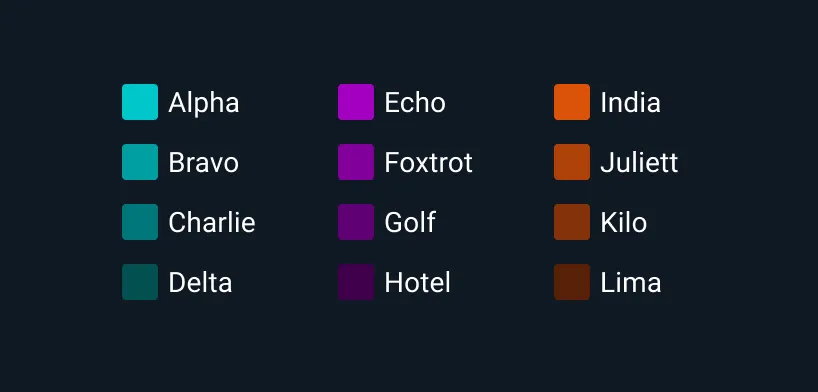
The following sample color set is provided for the specified number of data points. Astro dictates 11 or less colors per data set to reduce cognitive load. The mixed accessible palette was designed to meet a colorblind accessibility requirement. The vast majority of colorblind users are able to detect contrast variance as demonstrated in the following simulations.
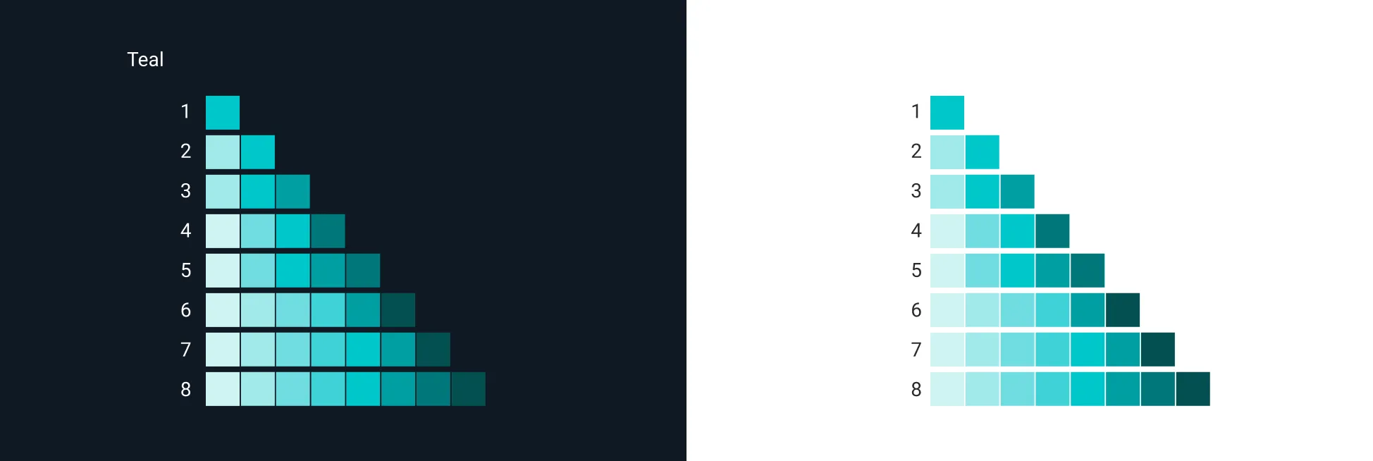
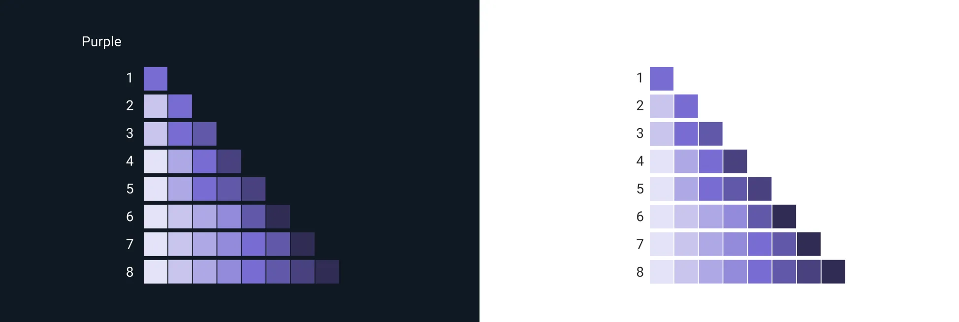
Gradual Visualization Palettes
The following sample color sets were created from the non-status color palettes:
Status colors are reserved for their respected statuses. Do not apply them to Visualizations unless they reflect the defined status, e.g. Critical.
Themed Visualization References
Astro provides guidance, components and code for creating a light and dark themed User Interface. Use cases and additional information on selecting the appropriate UI can be found in the Theme guidelines. The following references demonstrate both.
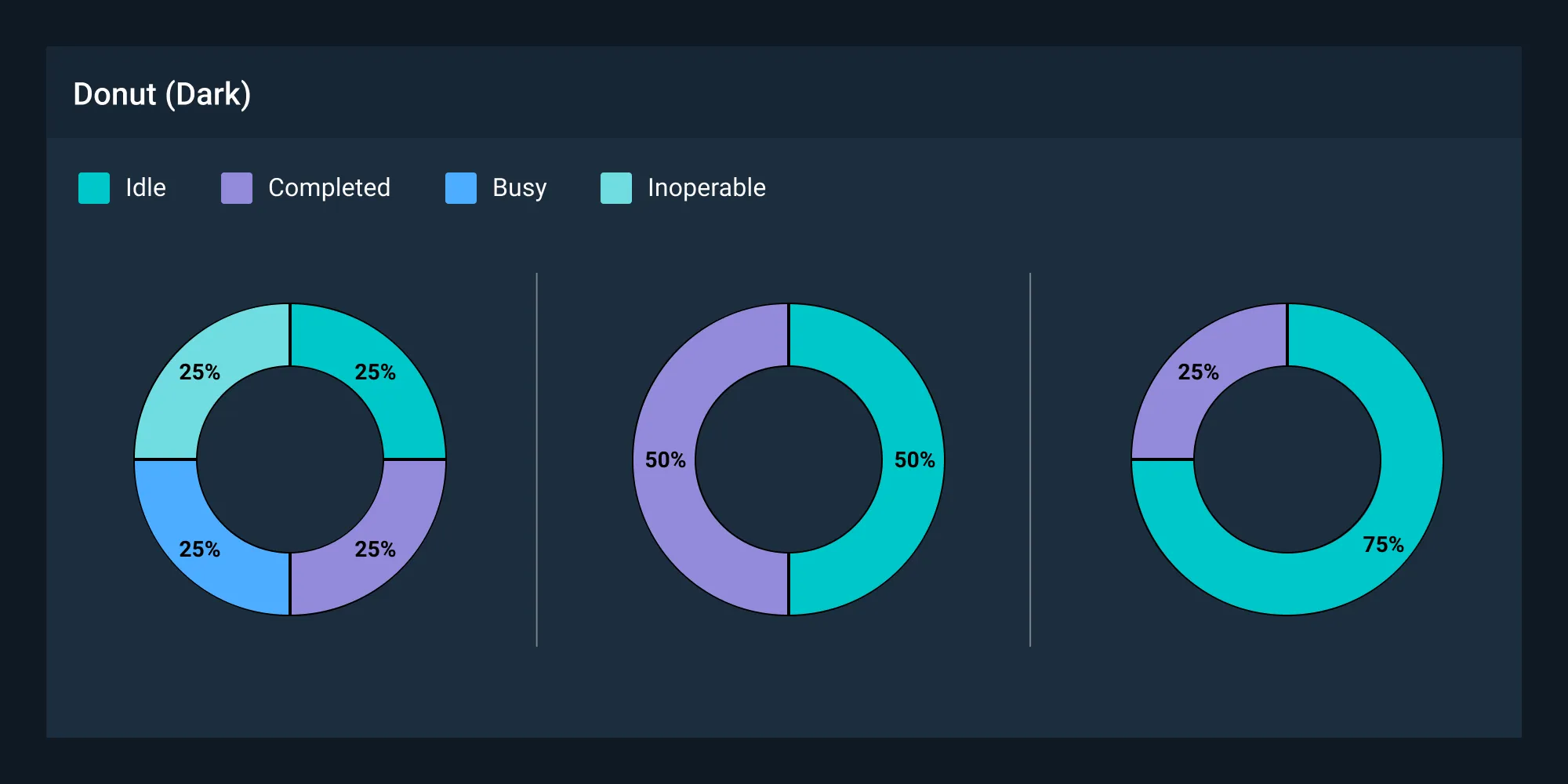
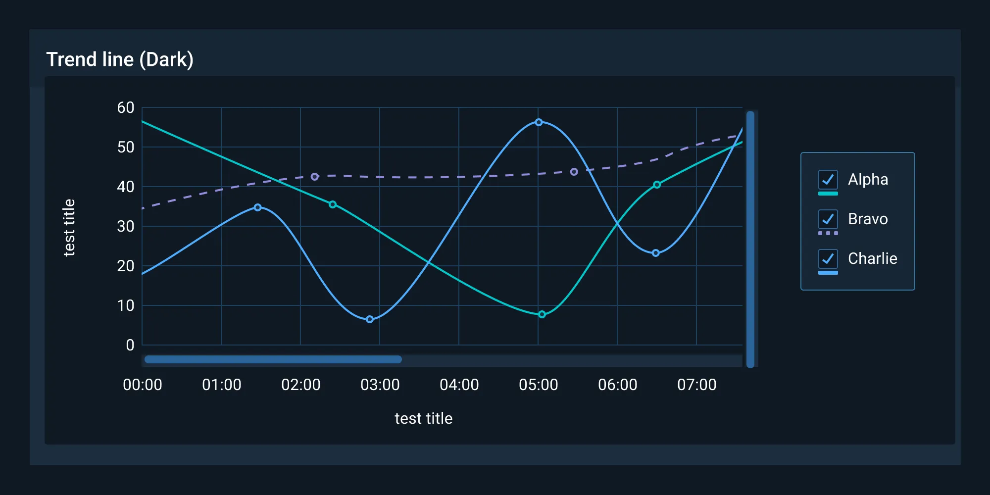
Line charts and similar visualizations may require higher contrast than a filled graphic, e.g. Donut chart.
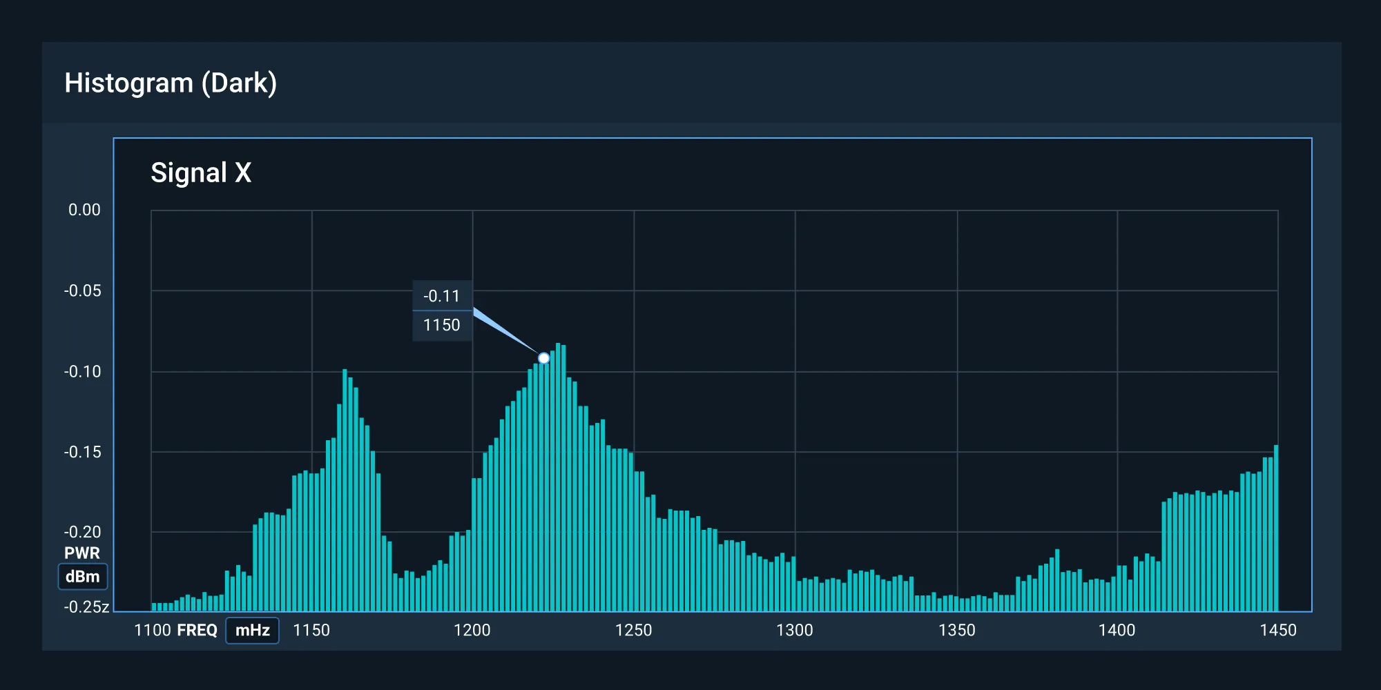
Dark-themed UIs help reduce eye strain and support visual clarity within the interface. This is ideal in a lights-out environment.
Choose the Right Visualization
A data visualization is useless if not designed to communicate clearly with the target audience. It should be compatible with the audience’s expertise and allow viewers to view and process data easily and quickly. Take into account how familiar the audience is with the basic principles being presented by the data, as well as whether they’re likely to be viewed on a regular basis.
Examples
Color Ordering
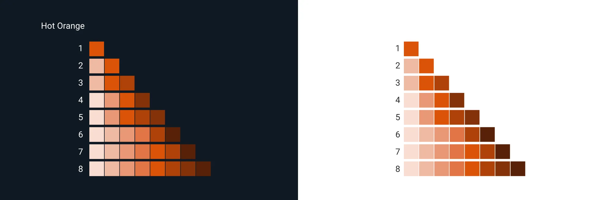
Astro Data Visualizations have their own color palette subset. Current Data Visualization colors follow a categorical or qualitative order where the hues differ but the intensity and saturation are similar.
The Data Visualization colors use design tokens ordered from 1-8. The color order is not required to start at 1, but could instead start in the middle of the order. However, from that point, the ordering should increase numerically. For example, if the color order started at 5, it would follow with 6, 7, 8, 1, 2, 3, 4. This color order has its own token set and can be found in the system tokens as color data visualizations.
Because the color contrast of neighboring colors does not meet WCAG contrast requirements, we recommend adding a divider between each section.
Implementation
Astro recommends 2 third-party libraries for data visualization: Apex Charts and ChartJS. Which one to use will depend on your own use cases. For the majority of applications, Apex Charts is preferred due to its ease of use and theme support. However, if your application is data intensive, ChartJS will be more performant.
Apex Charts
- Supports theming via CSS Custom Properties so you can toggle between light and dark mode easily.
- Renders in SVG so visualizations look crisp when zoomed in.
ChartJS
- Renders in Canvas which is more performant when dealing with large datasets.
Asset Status
| Asset | Version | Status |
|---|---|---|
| Documentation | N/A | Available |
| UI Kit - Dark | v7 | Available |
| UI Kit - Light | v7 | Available |
| UI Kit - Wireframe | v7 | Available |
| Web Component | N/A | Not Available |
| Component Tokens | v1 | In Progress |