Interactive Example
Rules of Thumb
- Use when there is a wide variability in a user’s responses to a prompt and that input is longer than a single line
- Does not utilize text formatting for the Textarea.
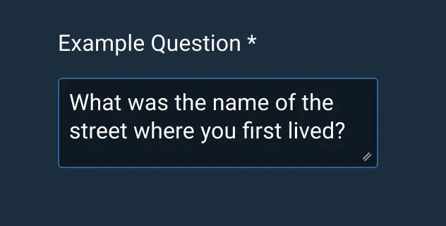
- Every Textarea should have a label. A Textarea without a label is ambiguous and not accessible.
- For sizing, consider the amount of text likely to be input into the field:
- By default, start with two rows.
- Where space is limited such as inside a modal, limit manual resizing.
- On page load, if the Textarea already contains large amounts of text, consider resizing to reveal the full text.
Appearance and Behavior
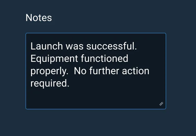
Textareas consist of a text input field with a short, descriptive label and a resizing handle in the bottom right corner of the field container. There is a 1 px inside border, and padding applied to the left, right, top, and bottom of the text.
Text
Textareas can have default text, or placeholder text, within them by default. Placeholder text can be used when the user has little to no familiarity with the subject matter and needs guidance.
Sizes
There are three different sizes of Textarea components: Small, Medium, and Large. These sizes are used to maintain correct padding for text depending on content.
States
Textareas have four different states: Active, Hover, Invalid, and Disabled.
Resizing
The user is allowed to manually resize the text area components to fit whatever content they intend to capture in the input. Developers should select an appropriately sized component to preserve the correct padding for the desired input length.
Examples


Asset Status
| Asset | Version | Status |
|---|---|---|
| Documentation | N/A | Available |
| UI Kit - Dark | v7 | Available |
| UI Kit - Light | v7 | Available |
| UI Kit - Wireframe | v7 | Available |
| Web Component | v7 | Available |
| Component Tokens | v1 | Available |