Interactive Example
Rules of Thumb
- Use only predefined Button colors, sizes and fonts — don’t customize or alter them.
- Don’t design elements which look similar to Buttons but act differently. Buttons are actionable elements.
- Don’t activate Pop Up Menus from Buttons.
- Space Buttons evenly.
- Clearly title Buttons by choosing a verb that describes the action the user performs at precisely the moment the Button is clicked: “Save, Close, Print, * Delete, Change Password,” etc.
- Resize Button width to accommodate the title; do not abbreviate or truncate Button titles.
- Don’t use an outside label to introduce a Button. Instead, clearly title the Button.
- Add an ellipsis (…) to the Button title if it opens another window, Dialog, or app.
- When using an ellipsis (…), don’t use sentence fragments or leading commands.
- It is recommended that actions should not be truncated with an ellipsis (…). However, if you must use ellipses for both truncation and to indicate further action is needed, add additional space after the ellipsis for those that require further action in order to clarify that they are not truncated.
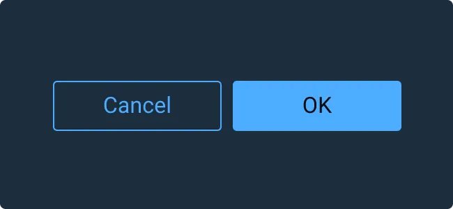
- In Button groups, the primary Button with the preferred user action shall be placed on the right and all Buttons with secondary actions to the left of the preferred action Button.
- Position Buttons consistently across the application. Unless there is a good reason not to, right-align Buttons in Astro applications.
Appearance and Behavior
Kinds
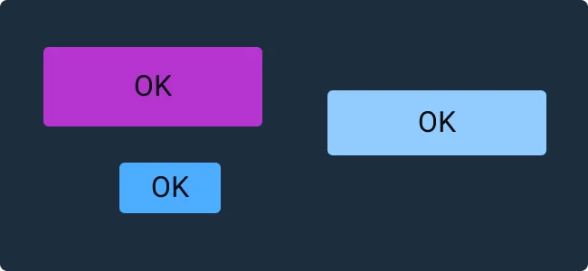
Astro offers three kinds of buttons, Primary, Secondary, and Borderless, to create a hierarchy among different buttons in your application.
- Primary - Primary buttons are the most visually prominent button and should be used for the most critical actions.
- Secondary - Secondary Buttons are an alternative Button style to be used in situations where a de-emphasized button is beneficial in guiding the user to a preferred option. For example, use a Secondary Button for the less preferred option in OK/Cancel Button pairings.
- Borderless - Borderless buttons are the least visually prominent button and should be used for less important actions.
Size
Buttons come in three standard sizes: Small, Medium, and Large. Medium buttons are suggested as the default option to use in a layout. Small buttons can be used when there is not much space available. Large buttons are rarely used, but can highlight a particular action when more space is available like on a full page Sign In form.
State
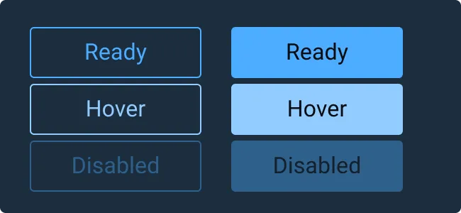
Standard states for Buttons include: Default (Button is enabled, clickable), Hover (the user has paused over an active or focused Button), and Disabled (the Button is not interactive, and its content is not sent when the form is submitted).
Examples
Asset Status
| Asset | Version | Status |
|---|---|---|
| Documentation | N/A | Available |
| UI Kit - Dark | v7 | Available |
| UI Kit - Light | v7 | Available |
| UI Kit - Wireframe | v7 | Available |
| Web Component | v7 | Available |
| Component Tokens | v1 | Available |
Status Key
AvailableIn ProgressPlannedNot AvailableDeprecated