Interactive Example
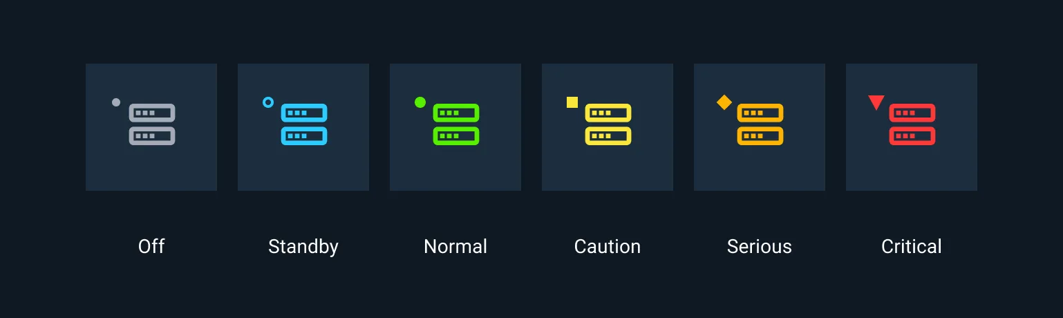
Each icon, symbol, or notification symbol must be easily identifiable by users and also be immediately distinguishable from each other, eliminating confusion and mistakes.
Astro’s icons have been designed to utilize the Astro Status System.
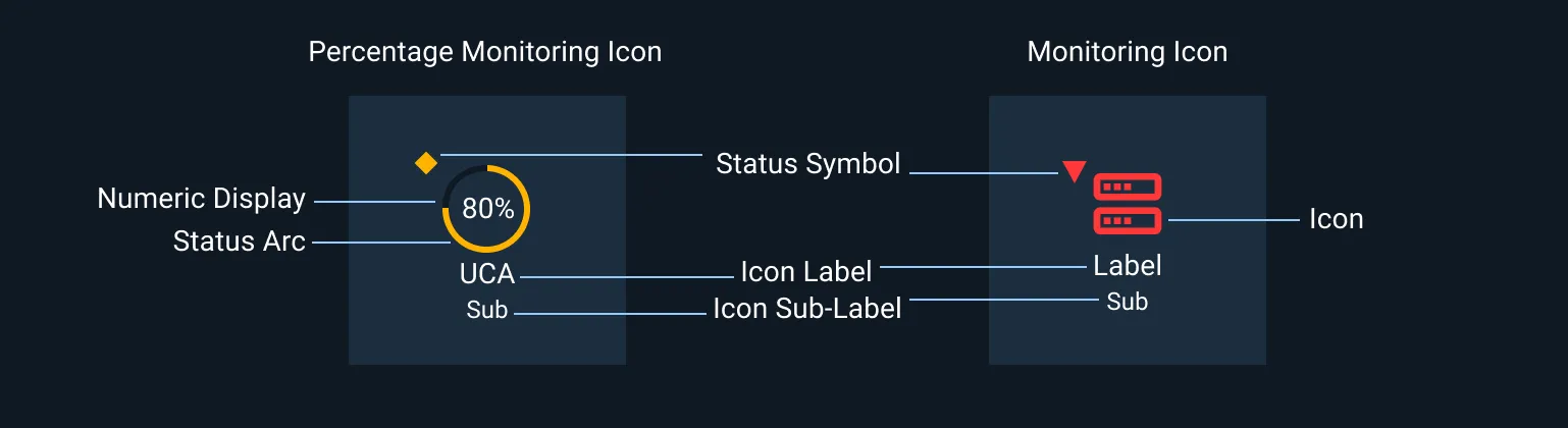
Monitoring Icons must include a label, and a status indicator. When used in a light theme status indicators must also include a border around the status indicator as assigned in Astro’s Component Design Tokens.
Astro Icon Classes
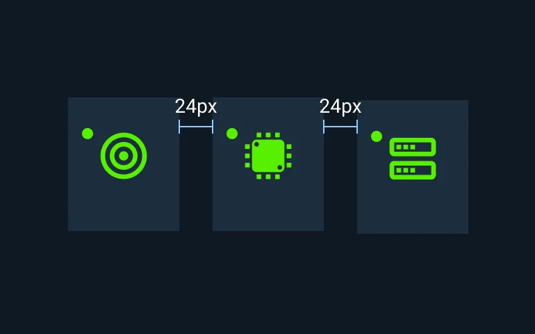
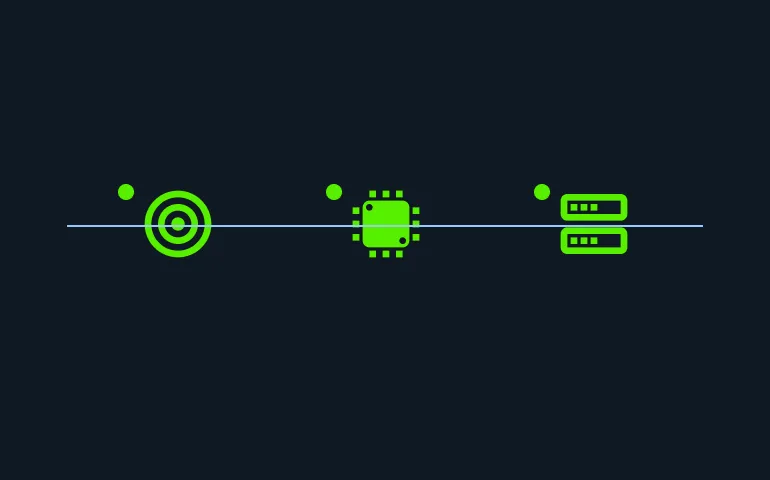
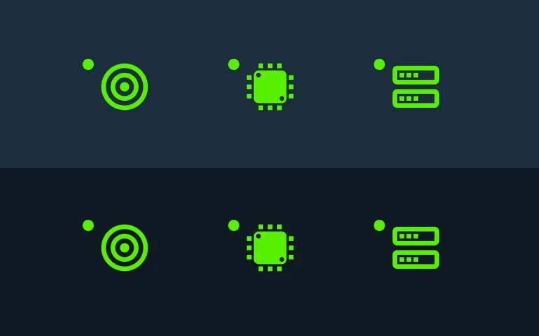
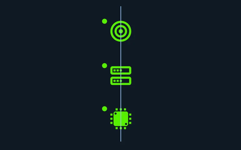
Monitoring Icons
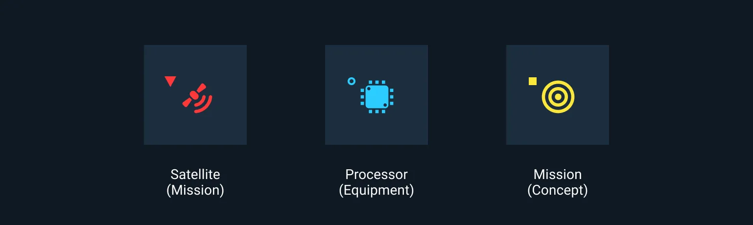
These icons represent objects, equipment, and concepts that are being administered or monitored. The purpose of these icons is to easily, concisely, and clearly visually communicate their status to users.
Labeling
An Icon may also include a Label and Sub-Label.
An Icon Label provides the name of the item being represented. An Icon Label should not change.
An Icon Sub-Label provides additional information to the user and may be dynamic. Use Sub-Labels only as needed to avoid unnecessary distraction.
Percentage Monitoring Icons
Percentage Monitoring Icons depict a value between 0 and 100 as an arc and a numeric display. Ranges within the arc may be mapped to the standard Astro Status Colors. In this example the range containing 80% is mapped to Serious.
Notification Symbols
Events that require some user attention, but no immediate response, may be indicated by changes to a Notification Symbol.
This Notification Symbol shows that ninety-nine events related to a Satellite have occurred. You may hyperlink indicators to reveal a deeper view of relevant Notification information. You may also link to the general Log.
Examples
Asset Status
| Asset | Version | Status |
|---|---|---|
| Documentation | N/A | Available |
| UI Kit - Dark | v7 | Available |
| UI Kit - Light | v7 | Available |
| UI Kit - Wireframe | v7 | Available |
| Web Component | v7 | Available |
| Component Tokens | N/A | Planned |