Interactive Example
Rules of Thumb
- Stacked Input Fields are left justified to one another.
- Use consistent spacing between stacked fields.
- Don’t use text smaller than what is defined in the CSS. Text size within fields is critical to usability.
- Generally, the size of the Input should match the length of the expected Input content.
- Use Help Text to provide validation support, rather than placeholder text.
- Do not use placeholder text for information that is vital to the user’s understanding of the text Input. A placeholder will disappear once the Input has focus and it should only be used for short, clear and generic instructions, such as using “Search…” in a Search field.
- Use required and optional indicators depending on their frequency. e.g. If more fields are optional, only mark required fields.
- When indicating required fields, an asterisk should be placed to the right of the label.
- When indicating optional fields, add the word optional in parenthesis to the right of the label.
- When implementing numeric inputs, utilize browser defaults whenever possible. Define the range and step size within the HTML element when appropriate. Include the range and step size values in the help text.
- When appropriate, use Input masking to automatically format a user’s entry. E.g., when entering a phone number, apply a consistent, recognizable format like (XXX) XXX-XXXX or another similar format.
Appearance and Behavior
An Input Field consists of a descriptive, concise label paired with an entry field. Optionally, Inputs may include Help Text, left-aligned beneath the Input, to assist the user in understanding what kind of content is accepted by the Input. Inputs displayed in a form may also be paired with a visual indicator of a required, or optional state. Disabled Inputs are displayed with a different opacity and cannot be interacted with by the user.
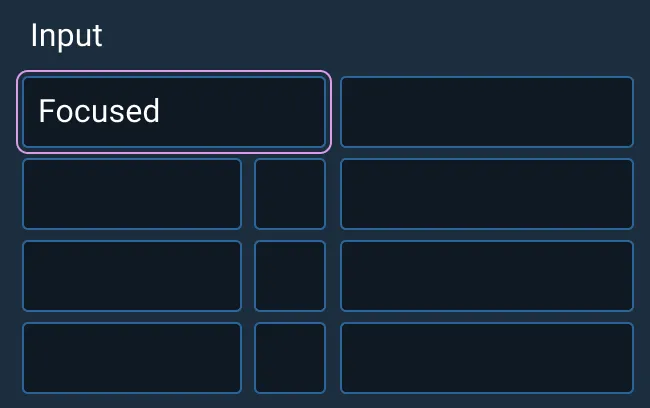
Standard states for Input Fields include Default (the initial, interactive state for a text Input), Hover (the user has paused over an active or focused Input), Focus (the field is selected and ready for data entry), Invalid (the field shows an error in data entry or formatting, such as going over a character limit), Disabled (the field is not interactive, and its content is not sent when the form is submitted), and Read-only.
An Input Field is enabled if it is eligible for interaction and focused if it is the current target for keystrokes.
An Input Field can be configured for required input, limited data ranges, or specific data formats. To learn more about adding Help Text or Validation to Input Fields, see the Forms and Validation guidance.
Input Fields have a smaller variant which may be beneficial in layouts where space is at a premium.
Examples

Asset Status
| Asset | Version | Status |
|---|---|---|
| Documentation | N/A | Available |
| UI Kit - Dark | v7 | Available |
| UI Kit - Light | v7 | Available |
| UI Kit - Wireframe | v7 | Available |
| Web Component | v7 | Available |
| Component Tokens | v1 | Available |