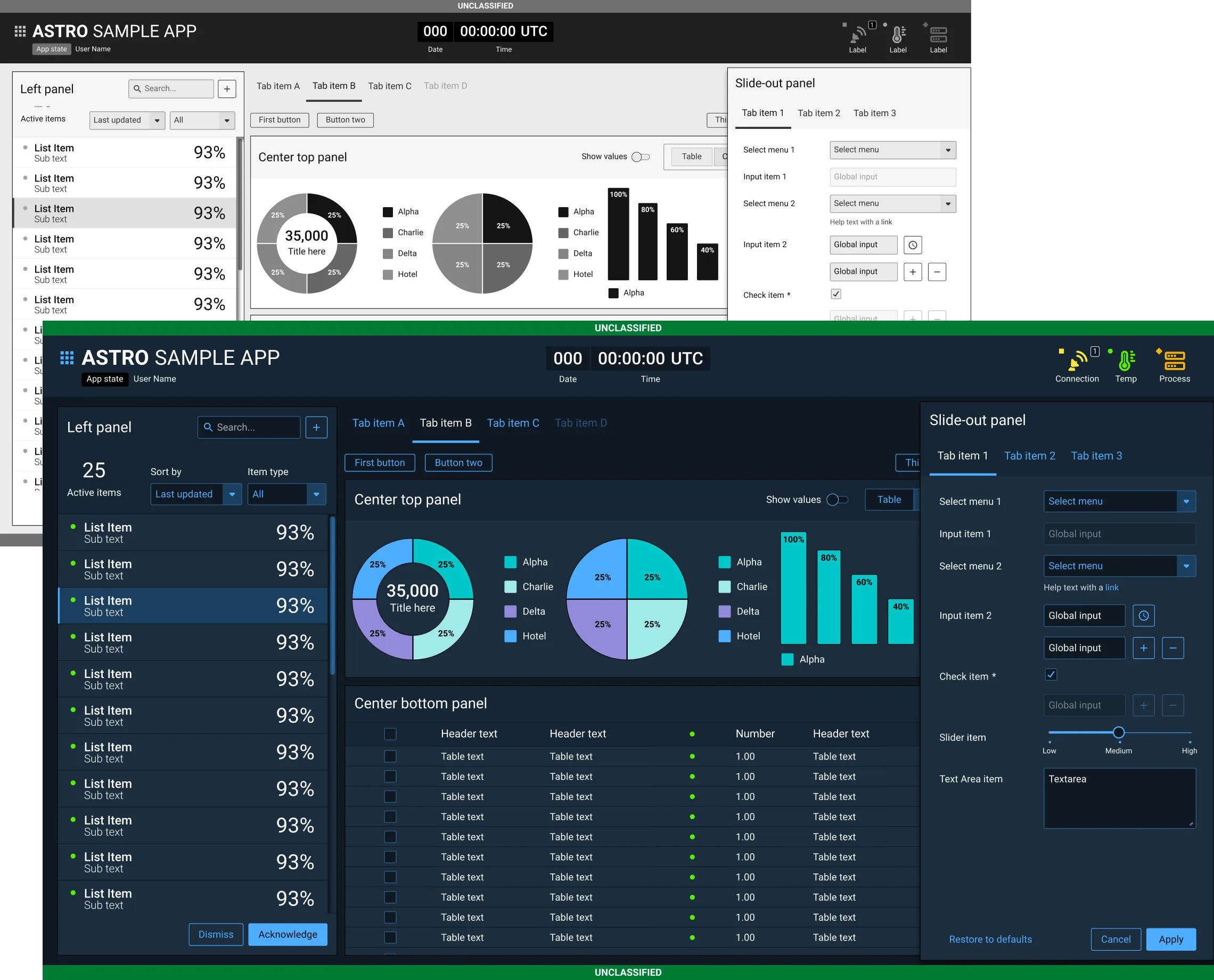
The visual design supports key functionality such as monitoring the health and status of systems, logically grouping common tasks and related data, and rapid identification of different equipment. The Astro visual language is comprised of specific colors, fonts, icons, widgets and controls.
If an application requires the design of unique application elements that aren’t covered in the guidelines, make the new designs complement the Astro visual language. Whenever possible, use the same color palette, fonts, and icon style. The goal is to evolve the visual language to meet specific application needs, not redesign it.
All icon metaphors must be the same across applications. Don’t assign them new meaning. It’s important that icons have metaphors that are quickly identifiable and clearly distinguishable from one another. To maintain consistency, when creating new icons, make sure they use the same design style, colors, and sizes.
Once you have completed the interface with wireframes, it’s time to consider the visual design. Visual design focuses on the overall aesthetics of the interface. A good visual design should reinforce the appropriate use of the functionality and communicate the overall goal of the user. For example, if the most important goal of the application is to communicate overall health and status of the system, the visual design should reinforce communication through use of color, imagery, and designed controls.
Well-designed UI frameworks are a prerequisite for good visual design as one plays off the other. For instance, good groupings of information, such as status iconography, helps the visual design communicate the appropriate message at the right time. User interface and visual design should be synergistic rather than in competition with each other. Again, understanding common patterns and placement of UI elements and widgets used within Astro apps help lay the groundwork for a cohesive visual presentation of information.
Visual design is an enhancement of the user interface design. Combined, each discipline creates the overall user experience. Appearance, behavior, and satisfaction all come into play in how users judge an application. Each interaction affects how users interpret and evaluate an application. What users see conveyed through layout, color, type, imagery, controls, and affordances affects not only their first impression, but also how they use the application.
Visual Design Principles
Visual Design can be somewhat elusive to many developers. The Astro UX Guidelines provide a robust UI Component Library supported by visual examples that detail best practices and common mistakes. Review these core visual design principles and tools that support the creation of a successful visual language.
Consistency
- Establishes and supports user expectations
- Speeds learning
- Reinforces task efficiency and accuracy
- Examples:
- Elements and controls look and behave the same
- Status panels and key controls are in the same location
- Iconography utilizes consistent metaphors for like functions and are styled the same
Hierarchy
- Reinforces workflows
- Establishes relative importance and relationships
- Established through size, placement, color and design style
- Examples:
- Layout reinforces workflow (typically top left to bottom right)
- Status Indicators that must be monitored, are always large and prominent
- Header type is larger and more prominent than content type
Personality
- Reinforces perception of application quality
- Supports user expectation of application usability
Five Visual Design Tools
Layout
- Establishes expectations of where things belong
- Addresses positioning, alignment, spacing, and grids
- Reinforces hierarchy
Type
- Legibility: size, style, spacing, and contrast
- Provides quick recognition and readability speed
- Reinforces personality
Color
- Establishes and reinforces consistency
- Reinforces hierarchy
- Reinforces personality
- Affords status heat
Iconography and Imagery
- A pictorial language to quickly identify states, objects, tools, and actions
- Reinforces consistency, hierarchy, and personality
- Image metaphors are quickly identifiable and distinguishable
- State indicators are quickly identifiable and distinguishable
Controls and Affordances
- Controls: Interactive interface elements which may be singular or widgets comprised of many controls
- Affordances: Visual properties that provide visual cues for quick usability recognition (for example: “Click” versus “Drag” interaction)
- Reinforces Consistency and Personality: Utilizing these methodologies, the UI Component Library and visual examples provide a framework of compliance standards for an application visual language design.