Interactive Example
Rules of Thumb
- Select Menus should display a list of multiple values.
- When it will not affect usability and is appropriate to the user’s cognitive flow: default a selected value.
- Select Menus may default to a state that instructs users what to do. For example: “Select Modem” or a default choice like “Modem X.”
- When the user knows what they’re looking for in advance, consider using a text field with client-side auto-complete functionality instead.
- Consider including advanced functionality enhancing behavior, such as auto-complete and intelligent filters.
- Items in a list should be ordered in a meaningful way, such as by value, alphabetically, or by recently selected.
- Keep the number of list values to a reasonable number to avoid endless scrolling. Alternative components, such as Input Fields and Search (with auto-complete and appropriate validation) or Table pattern instead, could be used rather than making users scroll through large quantities of data.
- Do not remove disabled items from the selection list. Disabled items should give a visual indicator of their disabled state, without hover.
- Use appropriate field labels, placeholder text, and Help Text when possible to assist the user in selecting an appropriate value.
- Use an ellipsis (…) to indicate to users that further action is required to complete a command. The ellipsis character means that a Dialog Box or a separate window will open allowing users to make additional choices or supply additional information to complete the action.
- Use Inline Select to execute condition-based functions that require users to select necessary data to complete a task.
Appearance and Behavior
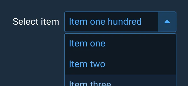
Select Menu
The Select Menu component consists of an input field containing a downward facing caret icon. Clicking on the caret expands a list of items (below, or above if there is no room below due to the position of the component on screen) related to the input field. Once an item in the list is selected, the selection is populated in the input field.
To learn more about adding Help Text or Validation to Select Menus, see the Forms and Validation guidance.
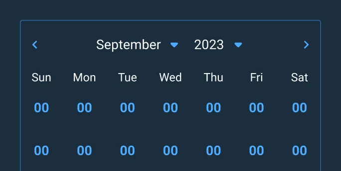
Inline Select Menu
The Inline Select Menu is a borderless variant resulting in less visual weight which provides visual hierarchy. The inline variant can be used with form-based experiences allowing users to select an item from lists in multiple select fields, such as month and year selectors.
Examples
Asset Status
| Asset | Version | Status |
|---|---|---|
| Documentation | N/A | Available |
| UI Kit - Dark | v7 | Available |
| UI Kit - Light | v7 | Available |
| UI Kit - Wireframe | v7 | Available |
| Web Component | v7 | Available |
| Component Tokens | v1 | Available |
Status Key
AvailableIn ProgressPlannedNot AvailableDeprecated