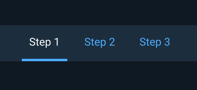
Interactive Example
Rules of Thumb
- Use only one row of Tabs.
- Use higher level Tabs only on top of the panel.
- Tab labels should not be more than two words and should accurately reflect what underlying content the user can expect to reveal.
- Use title-style capitalization for labels.
- High level Tabs are often used to organize an application by work process.
High Level Tabs are often process/workflow oriented. Process oriented Tabs should:
- Appear in the upper left quadrant.
- Be clearly labeled.
- Guide users through a sequential process.
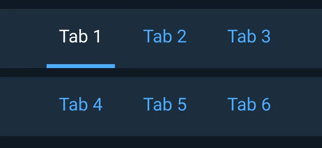
Interior/Compact Tabs
For use outside of main navigation, a more compact Tab component can be used.
Rules of Thumb
- Use only one row of Tabs.
- Tab labels should not be more than two words and should accurately reflect what the user can expect to see.
- Use sentence case capitalization for labels.
Examples
Asset Status
| Asset | Version | Status |
|---|---|---|
| Documentations | v7 | Available |
| UI Kit - Dark | v7 | In Progress |
| UI Kit - Light | N/A | Planned |
| Web Component | N/A | Not Available |
| Component Tokens | v7 | Deprecated |
Status Key
AvailableIn ProgressPlannedNot AvailableDeprecated