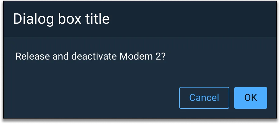
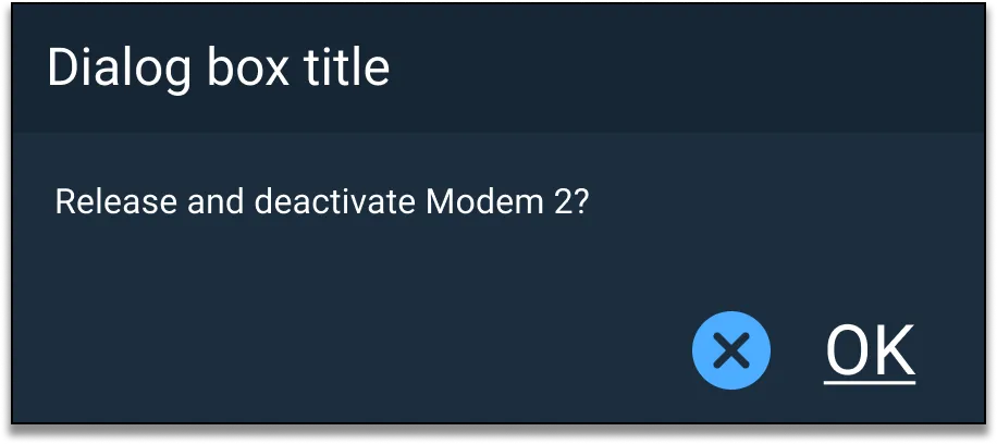
Interactive Example
There are two types of Dialogs, modal and non-modal. A Modal Dialog blocks the user from interacting with any content in the background as long as it remains open. A Non-modal Dialog, however, does not impose such restrictions. In general, users will encounter Modal Dialogs when dealing with critical tasks or information that requires action or acknowledgement, while Non-modal Dialogs are more typically tied to optional tasks requiring no user acknowledgement or validation.
Rules of Thumb
- Use a Dialog to:
- Ask users to confirm irreversible, destructive or expensive actions.
- Notify the user of an urgent event.
- Titles must be concise and understandable without additional context.
- Dialog text must clearly express intent and actions required of the user.
- Use buttons within a Dialog to represent available user actions. Avoid using links or other components.
- Buttons should be right aligned with the primary action as the furthest right button.
- There may be exceptions when not all buttons are right aligned. For example, a destructive or dangerous secondary action button, like “Delete,” may be left aligned to distance the button from other actions, like “Save” and “Cancel”.
- Each button label should use a verb that accurately and specifically reflects its associated action (e.g. “Save”).
- When presenting a Modal Dialog, use a “scrim” or dimmed full-screen overlay behind it to signal to the user that background content can’t be accessed. If background content is necessary for context, consider a Non-modal Dialog instead.
- Dialogs should include at most one primary button; multiple secondary buttons are allowed.
- Use Dialogs sparingly, as they interrupt critical workflow.
- Dialogs must be actively closed by the user — self-dismissing dialogs should not be used.
Appearance and Behavior
Structurally, a Dialog is comprised of a container with a title at the top, a content body containing relevant textual and/or visual information, and one or more action buttons at the bottom (e.g. “Accept”, “Cancel”, or “OK”).
Regardless of type, Dialogs will be invoked by user action. This may involve direct intervention (e.g. clicking on an “Edit” icon) or indirect action (e.g. attempting to navigate away from a page with unsaved changes).
Examples


Asset Status
| Asset | Version | Status |
|---|---|---|
| Documentation | N/A | Available |
| UI Kit - Dark | v7 | Available |
| UI Kit - Light | v7 | Available |
| UI Kit - Wireframe | v7 | Available |
| Web Component | v7 | Available |
| Component Tokens | N/A | Planned |