Interactive Example
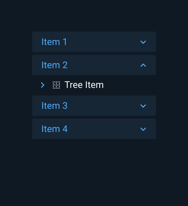
While Accordions are often used to present information hierarchy or hide lengthy descriptive text, they may also be used to display controls, input fields, and data visualizations.
Appearance and Behavior
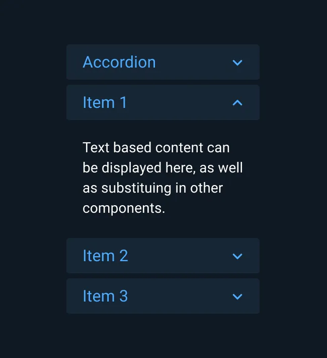
Clicking on an item in an Accordion selects and expands that item. Once expanded, the user may click on the header to return the item to its collapsed state.
In the collapsed state, only the header portions of Accordion items are visible. The header consists of a title and right-aligned caret icon. When Accordion items are disabled, they remain collapsed and non-interactive, with an opacity applied to give them a “greyed out” appearance.
It is common practice to allow multiple Accordion items to be expanded at once. In some cases, however, it may be necessary to limit expansion to one item at a time.
Best Practices
- Differentiate the Accordion header from its content via color, spacing, separator lines, or other methods.
- Use spacing and background shading to achieve separation between Accordion items.
- If content needs to be visible at all times, use a different component or design pattern instead of an Accordion.
Asset Status
| Asset | Version | Status |
|---|---|---|
| Documentation | N/A | Available |
| UI Kit - Dark | v7 | Available |
| UI Kit - Light | v7 | Available |
| UI Kit - Wireframe | v7 | Available |
| Web Component | v7 | Available |
| Component Tokens | N/A | Planned |