Interactive Example
Appearance and Behavior
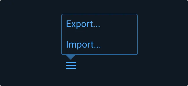
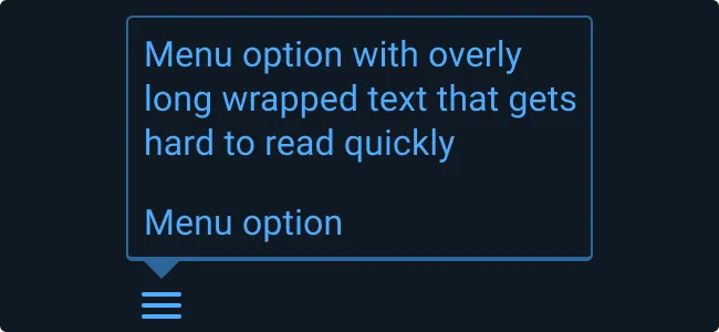
While rules governing the Pop Up Menu appearance and behavior generally mirror that of the generic Pop Up component, the width of its container will automatically adjust based on the width of the text content, which may be comprised of anything from a single menu item to a list of multiple items (up to a limit of 25 items).
Rules of Thumb
- Select menu item names that are accurate and informative allowing user to predict the result of choosing an item.
- Use separators to indicate groups of related items.
- Use an ellipsis (…) to indicate to users that further action is required to complete the command. The ellipsis character means that a Dialog Box or a separate window will open allowing users to make additional choices or supply additional information to complete the action.
- If you use more than one word in a menu item name, be sure to use sentence case capitalization.
- Choose menu names that are short and precise. Do not use an ellipsis to truncate overflow text as this indicates that further action or another dialog or window is required before the action takes place.
- Avoid combining actions and attributes in the same group. Users tend to view choosing an action (e.g. “Delete item”) differently from choosing an attribute (e.g. “Rating”).
- When using an ellipsis (…), don’t use sentence fragments or leading commands.
- It is recommended that actions should not be truncated with an ellipsis (…). However, if you must use ellipses for both truncation and to indicate further action is needed, add additional space after the ellipsis for those that require further action in order to clarify that they are not truncated.
Examples
Asset Status
| Asset | Version | Status |
|---|---|---|
| Documentation | N/A | Available |
| UI Kit - Dark | v7 | Available |
| UI Kit - Light | v7 | Available |
| UI Kit - Wireframe | v7 | Available |
| Web Component | v7 | Available |
| Component Tokens | N/A | Planned |
Status Key
AvailableIn ProgressPlannedNot AvailableDeprecated